Ever had a brilliant idea and thought, “I should build a website for that”? It’s easier than you think. Building a website can be a daunting task, but with the right tools and knowledge, it’s entirely doable.
In this comprehensive guide, we’ll walk you through how to build a website from scratch. From choosing a domain name to designing your website, we’ve got you covered. So, let’s dive in!
Choosing a Domain Name
Your domain name is your website’s online address. It’s crucial to choose a domain that is easy to remember, relevant to your website’s content, and available. Here are some tips for choosing a domain name:
- Keep it short and simple: Avoid long, complicated domain names.
- Make it memorable: Choose a domain that people will easily remember.
- Use relevant keywords: Incorporate keywords related to your website’s topic.
- Check availability: Use a domain registrar to check if your desired domain is available.
Selecting a Web Hosting Provider
Web hosting is essential for making your website accessible online. A web hosting provider stores your website’s files and makes them available to visitors. When choosing a web hosting provider, consider the following factors:
- Storage space: Ensure you have enough storage space for your website’s files.
- Bandwidth: Consider the amount of data your website will need to handle.
- Uptime: Choose a provider with a high uptime guarantee.
- Customer support: Look for a provider with excellent customer support.
Examples of popular web hosting providers:
- Bluehost: Known for its affordable shared hosting plans and excellent customer support.
- HostGator: Offers a variety of hosting plans, including shared, VPS, and dedicated servers.
- SiteGround: Renowned for its speed and security features, as well as its reliable customer support.
- DreamHost: Provides a range of hosting options and is popular for its managed WordPress hosting.
- Godaddy: A large web hosting provider offering a variety of plans and services.
- WP Engine: A particularly popular for businesses and websites that require high levels of performance, security, and scalability. Their managed WordPress hosting services include automatic updates, backups, and 24/7 support. This is our personal favorite.
Designing Your Website
The design of your website is crucial for attracting and retaining visitors. Here are some key elements to consider when designing your website:
- User experience: Make your website easy to navigate and use.
- Visual appeal: Use attractive design elements and colors.
- Mobile-friendliness: Ensure your website is optimized for mobile devices.
- Content organization: Structure your content in a logical and easy-to-follow manner.
Explore our website services →
Creating High-Quality Content
Content is the backbone of your website. It should be informative, engaging, and relevant to your target audience. Here are some tips for creating high-quality content:
- Keyword research: Identify relevant keywords to target your audience.
- Original content: Create unique and original content.
- Optimize for SEO: Use keywords strategically throughout your content.
- Visuals: Incorporate images, videos, and infographics to enhance your content.
Read more: Elevate Your Brand: The Power of Good Graphic Design →
Building Your Website
There are several ways to build a website. You can hire a professional web developer, use a website builder, or learn to code yourself. Here are some popular website builders:
WordPress
WordPress is a powerful content management system (CMS) that offers a high level of customization and flexibility. It’s a popular choice for bloggers, businesses, and individuals who want to create complex websites.
Pros:
- Customization: Highly customizable with thousands of themes and plugins.
- Community: Large and active community providing support and resources.
- SEO-friendly: Built-in SEO features and plugins to improve search engine rankings.
- Scalability: Can handle high traffic and complex websites.
Cons:
- Learning curve: Can be more complex to learn compared to drag-and-drop builders.
- Security: Requires regular updates and security measures to prevent vulnerabilities.
Wix
Wix is a popular drag-and-drop website builder that is easy to use, even for beginners. It offers a wide range of templates and features, making it a great option for those who want to create a website quickly.
Pros:
- Ease of use: Intuitive drag-and-drop interface for easy website creation.
- Templates: Wide variety of templates to choose from.
- App market: Offers a marketplace of apps to add features to your website.
- Free plan: Offers a free plan with limited features.
Cons:
- Limited customization: Less customizable than WordPress, especially for advanced users.
- Cost: Can become expensive for premium features and additional storage.
Squarespace
Squarespace is another popular drag-and-drop website builder known for its sleek and modern designs. It’s a great option for those who want to create a professional-looking website without coding.
Pros:
- Design: Beautiful and modern templates.
- Integration: Seamless integration with various platforms (e.g., social media, e-commerce).
- Customer support: Excellent customer support and resources.
- All-in-one solution: Includes hosting, domain registration, and website design.
Cons:
- Limited customization: Less customizable than WordPress, especially for advanced users.
- Cost: Can be more expensive than other website builders.
Webflow
Webflow is a visual web development platform that allows you to design and build websites without coding. It’s a great option for designers who want more control over their website’s layout and design.
Pros:
- Design control: Offers granular control over website design and layout.
- Interactive elements: Create interactive elements like animations and micro-interactions.
- Performance: Optimized for performance and speed.
- Collaboration: Allows for team collaboration on website projects.
Cons:
- Learning curve: Can have a steeper learning curve than other website builders.
- Cost: Can be more expensive than other options, especially for advanced features.
Promoting Your Website
Once your website is live, it’s time to promote it. Here are some effective promotion strategies:
- Search engine optimization (SEO): Optimize your website for search engines to improve your visibility.
- Social media marketing: Promote your website on social media platforms.
- Content marketing: Create and share valuable content to attract visitors.
- Email marketing: Build an email list and send regular newsletters.
- Paid advertising: Consider using paid advertising platforms like Google Ads or Facebook Ads.
Additional Considerations
- Website Security: Protect your website from hackers by using strong passwords, updating software regularly, and implementing security measures.
- Website Analytics: Track your website’s performance using analytics tools to measure traffic, engagement, and conversions.
- Website Maintenance: Regularly update your website’s content, fix any broken links, and ensure it is running smoothly.
Read more: How to Increase Website Traffic: A Comprehensive Guide →
Conclusion
Ready to start building your website? Contact us today for a free consultation. Our team of experts can help you create a stunning and effective website that will help you achieve your online goals.
Remember: Building a website is an ongoing process. It’s important to continue updating and improving your website to stay relevant and attract visitors.
In today’s digital age, a thriving online presence is essential for businesses of all sizes. One of the most crucial metrics to track is website traffic. Increased traffic can lead to more leads, conversions, and ultimately, business growth. This comprehensive guide will provide you with actionable strategies to boost your website’s traffic and achieve your online goals.
Understanding Website Traffic
Before diving into the strategies, it’s important to understand what website traffic is and why it matters. Website traffic refers to the number of visitors who access your website within a given period. It’s a valuable indicator of your website’s popularity, engagement, and potential for generating revenue.
Key Metrics to Track:
- Unique visitors: The number of distinct individuals who have visited your website.
- Page views: The total number of pages viewed on your website.
- Bounce rate: The percentage of visitors who leave your website after viewing only one page.
- Average session duration: The average time visitors spend on your website.
SEO Optimization: The Foundation of Increased Traffic
Search Engine Optimization (SEO) is the practice of optimizing your website to improve its visibility and ranking in search engine results pages (SERPs). By implementing effective SEO strategies, you can attract organic traffic from users searching for relevant keywords.
On-Page SEO:
- Keyword research: Identify relevant keywords that your target audience is searching for.
- Keyword optimization: Incorporate your target keywords naturally into your website’s content, including titles, headings, meta descriptions, and body text.
- Meta tags: Create compelling meta titles and descriptions that accurately represent your content and include your target keywords.
- Header tags (H1, H2, H3): Use header tags to structure your content and highlight important sections.
- URL structure: Create clean and descriptive URLs that include relevant keywords.
- Image optimization: Optimize your images with descriptive file names and alt text.
Off-Page SEO:
- Backlinks: Acquire high-quality backlinks from reputable websites to improve your website’s authority.
- Local SEO: Optimize your website for local search if you have a physical location.
- Social media: Promote your content on social media platforms to increase visibility and drive traffic.
Explore our Website services →
Content Marketing: Creating Value for Your Audience
Content marketing involves creating and distributing valuable, relevant, and consistent content to attract and retain a clearly defined audience. High-quality content can help you establish your website as a trusted authority in your industry and drive organic traffic.
Content Creation Strategies:
- Blog posts: Regularly publish informative and engaging blog posts that address your target audience’s questions and pain points.
- Ebooks: Create comprehensive ebooks that offer in-depth information on a specific topic.
- Videos: Produce videos to provide visual explanations or demonstrations of your products or services.
- Infographics: Use infographics to present complex data in a visually appealing way.
- Case studies: Showcase your success stories to demonstrate the value of your offerings.
Content Distribution:
- Social media marketing: Share your content on social media platforms to reach a wider audience.
- Email marketing: Build an email list and send regular newsletters to promote your content.
- Guest blogging: Contribute articles to other relevant websites to gain exposure and backlinks.
- Paid advertising: Consider using paid advertising platforms to promote your content to a targeted audience.
Read more: Content Marketing: How to Drive Growth and Engagement →
Technical SEO: Ensuring Your Website is Crawlable and Indexable
Technical SEO involves optimizing the technical aspects of your website to ensure that search engines can crawl, index, and understand your content.
Technical SEO Best Practices:
- Website speed: Optimize your website’s loading speed to improve user experience and search engine rankings.
- Mobile-friendliness: Ensure your website is fully responsive and optimized for mobile devices.
- XML sitemap: Create an XML sitemap to help search engines understand the structure of your website.
- Robots.txt: Use a robots.txt file to instruct search engines which pages to crawl and which to avoid.
- HTTPS: Implement HTTPS to secure your website and improve user trust.
Read more: How to Build a Website: A Beginner’s Guide →
User Experience (UX): Making Your Website Easy to Navigate and Use
A positive user experience is essential for keeping visitors engaged and encouraging them to return.
UX Optimization Tips:
- Clear navigation: Create a clear and intuitive navigation menu that allows visitors to easily find the information they need.
- Mobile-friendly design: Ensure your website is easy to navigate and use on mobile devices.
- Fast loading times: Optimize your website’s loading speed to reduce bounce rates.
- Engaging content: Create high-quality content that is easy to read and understand.
- Call to action (CTA): Use clear and compelling CTAs to guide visitors toward desired actions.
Social Media Marketing: Expanding Your Reach and Engagement
Social media platforms offer a powerful way to connect with your target audience, promote your content, and drive traffic to your website.
Social Media Marketing Strategies:
- Choose the right platforms: Identify the social media platforms where your target audience is most active.
- Create engaging content: Develop content that is tailored to each platform and encourages sharing.
- Build a community: Interact with your followers and foster a sense of community around your brand.
- Run targeted ads: Use social media advertising to reach a wider audience and drive traffic to your website.
- Analyze your performance: Track your social media metrics to measure your success and identify areas for improvement.
Explore our social media services →
Paid Advertising: Accelerating Your Traffic Growth
Paid advertising can be an effective way to quickly increase your website traffic and reach a targeted audience.
Paid Advertising Options:
- Search engine marketing (SEM): Run paid ads on search engines like Google to appear at the top of search results for relevant keywords.
- Social media advertising: Use targeted ads on social media platforms to reach specific demographics and interests.
- Display advertising: Display your ads on relevant websites and blogs.
- Remarketing: Retarget visitors who have previously interacted with your website to encourage them to return.
Explore our paid advertising services →
Analytics and Tracking: Measuring Your Progress and Optimizing Your Strategy
To track your website traffic and measure the effectiveness of your marketing efforts, it’s important to use analytics tools.
Popular Analytics Tools:
- Google Analytics: A comprehensive tool for tracking website traffic, user behavior, and conversions.
- Ahrefs: A tool for analyzing backlinks, keyword rankings, and competitor data.
- Semrush: A tool for SEO research, keyword tracking, and competitor analysis.
By using analytics tools, you can gain valuable insights into your website’s performance and make data-driven decisions to improve your marketing strategy.
Start Boosting Your Website Traffic Today
Increasing website traffic requires a combination of SEO optimization, content marketing, technical SEO, user experience improvements, social media marketing, and paid advertising. By implementing the strategies outlined in this guide, you can attract more visitors to your website, generate leads, and achieve your online business goals.
Remember: Consistent effort and ongoing optimization are key to maintaining and growing your website traffic over time!
Want to talk about increasing your website traffic?
Additional Resources:
- What is SEO? A Comprehensive Guide
- Content Marketing: Your Ultimate Guide to Creating Engaging Content
- The Power of Social Media: Why Your Business Needs a Strong Presence
- Lead Generation: The Fuel for Business Growth
- AI for Beginners: A Comprehensive Guide
We hate to burst your bubble, but… being pretty simply isn’t enough in the age of digital domination where user experience reigns supreme.

In today’s day and age, users simply demand more from websites than pretty graphics and flashy animations—they demand a seamless, hassle-free experience where they can intuitively find and get exactly what they need.
Ever clicked on a website and thought, “Did a toddler design this when they were coming down from a Peppa Pig sugar bender?”

Trust us; you’re not alone. It’s 2023, and if your website still feels like it belongs in the era of dial-up connections and floppy disks, it’s high time for a revamp. Or, um… Scratch that. Maybe, it’s time to simply polish that up, call it nostalgia, and market it to the youth?

However, the original point still stands. If users can’t find the information they need, what’s to stop them from clicking off your site and onto the 2 billion plus other competitors one away?
Is your site optimized for aesthetics, or is it actually designed for the very people it’s meant to serve?
Let’s look at some of the smartest ways to incorporate intuitive design into your website.
What Is Intuitive Design?
Intuitive design isn’t just a fancy term thrown around by bespectacled tech hipsters sipping overpriced organic soy lattes. It’s the secret sauce distinguishing between a website that feels like a sleek, luxury sedan and one that looks like the Yale School of Art.
Imagine handing Shakespeare a smartphone and expecting him to order a pizza. Sounds like a bad 90s rom-com starring Gwyneth Paltrow, right?

Intuitive design ensures that even old Will wouldn’t be left hungry. It’s about making your website so simple and instinctive that you can glide through without a hiccup whether you’re 5 or 95, tech-savvy or tech-averse. No confusion, no “where-the-heck-do-I-click-now” moments. It’s the digital equivalent of walking into a room and instinctively knowing where the light switch is.
Intuitive website design is all about creating an online experience that feels second nature to the user. This means prioritizing simplicity and clarity, ensuring that navigation menus are easy to find and understand and that content is structured logically. It’s about predicting the user’s needs and serving up the most relevant information or functionality right when they need it.
Elements like consistent color schemes, familiar icons, and recognizable patterns all play a role. The goal is to eliminate any friction or confusion, making the user’s journey from point A to point B feel like a breeze. When done right, intuitive design ensures that the user spends less time deciphering the website and more time engaging with its content or completing desired actions.
The 8 Characteristics of Intuitive Design
Eight pivotal attributes that help define intuitive design include:
- Simplicity: Ditch the fluff. In the age of the 8-second attention span, no one’s got time for a cluttered mess. Make it clean, make it fast.
- Consistency: Don’t make users play guessing games. Whether it’s a button or a color scheme, uniformity is crucial.
- Familiarity: Icons should be recognizable, not abstract art. A cart should scream “Buy,” not “What’s this?”
- Clarity: Speak human. If users need a dictionary or a tech guru by their side, you’re doing it wrong. Besides, no one likes to speak to IT people. No one. Need we give you more proof as to why?
- Feedback: People aren’t psychic. If they click something, they want to know what’s happening. Now.
- Flexibility: Not everyone surfs the web the same way. Design for the masses but allow for some mavericks.
- Efficiency: The fewer steps, the better. If your site feels like a labyrinth, users will head for the exit.
- Error Tolerance: Oops! Everyone screws up. Instead of a cold error message, hand them a digital roadmap back to sanity.
Bottom line? An intuitive design shouldn’t feel like a brain workout. Let users glide, not stumble.
Why Should Companies Opt for Intuitive Design?
If you can’t find a way to make it from your homepage to the checkout page in less than a minute, then it’s time to rethink your entire design. In this day and age, time is a commodity, and the internet has been trained to have an attention span the size of a TikTok video. The faster, easier, and more intuitive your design, the better the overall experience for your users and the less headache for your brand in the long run.
And besides, a simpler site doesn’t always equate to a stupider site. In fact, sometimes simple is much, much better when it comes to web design.

So let’s break down a few of the most important rules your site should follow.
Ain’t Nobody Got Time for That!
Consider Tik Tok the Pavlov of its time, conditioning users to anticipate immediate laughs, insight, or pleasure in the span of 60 seconds or less. They expect no less from their website. If users can’t find what they’re looking for in seconds, they’ll bounce faster than you did that time your Hinge date asked if you wanted to see how hard he could rev his Prius.

An intuitively designed website ensures that users don’t need a roadmap, a compass, or a seasoned sherpa to navigate to the exact destination they intend to visit—so having the right signifiers, icons, and website copy to guide users to their destination spot should come first and foremost before any other considerations.
First Impressions Matter. Like, a Lot
Remember that time you photo-dumped every drunk shot from your wild night out for, like, your entire college career? Yeah. Your employer didn’t. And on a side note, maybe that’s why millennials can’t afford housing?

Similarly, your website is often the first impression people have of your company. So don’t dump every ounce of your design knowledge you have onto the landing page.
An intuitive design should be simple, clean, and easy to navigate. A messy, overdone site either wreaks of a design agency going buck wild on their home page or suggests an inexperienced company unworthy of a user’s trust.
Reduced Tech Support Nightmares
Intuitive design isn’t just about looking good; it’s also about functioning seamlessly. No one wants to dial a helpline just to locate the “Contact Us” page. Making your page simple and easy to find human help when a user needs it most is one of the most critical things you can do for your site.
After all, the last thing you want is your eating disorder chatbot to help your clients by telling them to eat fewer calories… which is sadly a very true story.

And on that note, you should also resist the urge to over-automate. While Chat GPT and artificial intelligence can undoubtedly help direct customers to helpful advice or information, it’s still no substitute for a live human being on the other line.
Increased Conversion Rates
An easy-to-navigate site keeps visitors longer and makes them more likely to convert– be it signing up for a newsletter or making a purchase. Do you want your user’s journey to feel like a stroll in the park or a trek through the Amazon jungle with a broken compass?

It’s Cost-Effective in the Long Run
Think of intuitive design as a one-time investment that will pay off dividends in the future. Fewer redesigns, fewer customer support woes, and a significant drop in potential clients clicking away in frustration all translate to more pennies in your pocket.
Final Thoughts
To wrap this up, if you’re still on the fence about intuitive design, consider this: the digital realm is a brutal, unforgiving landscape. Sites that don’t adapt (read: aren’t user-friendly) get left behind.
So, unless you want your website to be a relic of a bygone era, discussed in hushed tones like the fact that you voted for Kanye for president before you realized you were really just encouraging an antisemite’s mental breakdown, then it’s high time you embrace intuitive design.

In the world of web design, remember: it’s survival of the fittest. Or, in this case, survival of the slickest. So if you’re looking for an extra hand to optimize your site design, the team at Tangible is ready to whip your site into tip-top shape.
So don’t be shy and go ‘head girl, go head get down… into our DMs.
…yeah, too soon.
We’re back, baby! Another year, another chance to spotlight some of our favorite design trends that we’re loving in the digital web-o-sphere this year, and it looks like some of our predictions from 2020 have had some serious staying power. And if we’re being completely honest, we secretly hope that all of the failed telekinesis training from when we were eight-year-olds trying to move the clock hand forward so that we could leave time out a few minutes early has finally paid off in the form of becoming clairvoyant.

While exposed grids, increased accessibility features, color blocking, and oversized type still reign supreme in the land of digital design, we’ve managed to compile a list of a few of the newest trends the post-pandemmy era is ushering in.
And while we don’t recommend hopping on any of the latest fads just because they’re cool at the moment (we’re looking at you, bucket hats and Crocs), we’ve compiled a list of some of the trends we see hanging around over the next few years.

So whether you’re looking for a website overhaul or simply planning to build a site that stays fresh for years to come, staying on top of the latest trends is essential to ensure your site remains relevant and consistent with your overall brand messaging.
Moving Typography
Animations aren’t just for artistic elements on a page anymore. In fact, we’re seeing an increased number of websites utilizing animations to bring typography to life. Why simply write a word when you can bring the essence of the word itself to life instead?
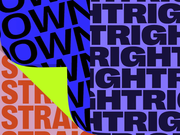
Along with text animations, we’re also seeing a growing amount of interactive text that comes to life whenever a user hovers over it. Not only do these animations add a sense of fun to a website, but they also work to visually draw attention to specific parts of a page (which is especially handy if you’re hoping to Jedi mind-trick a user into clicking on a specific link).

3D Art
3D graphic design technology has come a long way in recent years, with tools like Cinema 4D and Adobe making it possible to create realistic, three-dimensional artwork. We expect to see this trend grow in scope as graphic designers become more entrenched in the software programs used to develop these Pixar-like images and specialty fields specific to 3D graphic design expand.

Serif Fonts
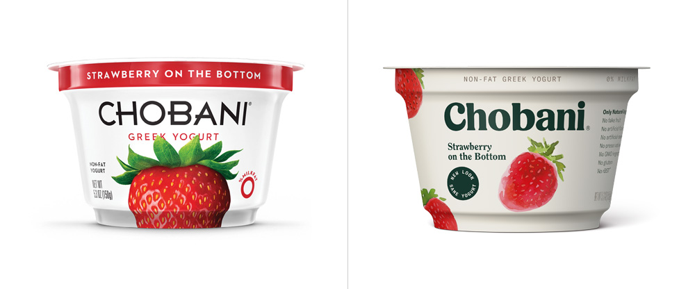
Serif fonts have been out of style for quite some time, at least until the past few years, when companies like Mailchimp and Chobani rebranded using bold Serif fonts for their logos, with many other businesses following suit.
While sans serif fonts have dominated the forefront of web and graphic design mediums over the past decade, many brands are utilizing bold colors paired with serif fonts to give their company a retro-chic, high-end vibe. We expect this trend to thrive in the coming year as 90s/Y2K nostalgia hits its peak stride with Gen Z.
Maximalism
So maybe you’ve always been under the impression that keeping it simple (stupid) is the way to go when it comes to web design. And while minimalism certainly has its place, many companies and brands are opting to use large typography, bold color combinations, and layered images to draw attention to the design.
Personally, we’re digging the bright colors and bold choices that maximalism encourages. Anything to get us out of the sad beige-everything era!
Claymorphism
Everyone, well, everyone except for the cold, heartless demons in the world who refuse to give animated movies a chance, has a fond place in their heart towards beloved Claymation figures like Jack Skellington, Coraline, and Wallace and Gromit. So it’s no wonder Claymation-style art renderings still prove popular across the web as a way to represent the human figure with an element of levity.
Typically used with a gradient background or to explain a company’s onboarding process, we don’t expect these 3D human figures to go anywhere anytime soon.
Behavioral-Based Design
Apps like Noom and Headspace are revolutionizing how notifications can be implemented to influence positive behavioral changes for their users. Behavioral design seeks to create a user experience curious enough for a person to change their habits. By crafting rewards, points, badges, and friendly reminders, these apps and websites exploit the human psyche to motivate people to change their behavioral patterns for the better. And it’s a trend we’re seeing across the mental health and physical wellness space, as apps designed to better our lives find ways to understand our basic psychological patterns.
And besides, if we’re being sincere, we love constantly feeling like a world-class athlete every time our Apple Watch rewards us for standing up, so… we’re all for trends that make us feel better about ourselves anyway.

Pixelation
Want a design aesthetic no millennial is sure to resist? As we mentioned earlier, the 90s are in fashion, and for whatever reason, the Y2K digital aesthetic is now something to be admired. On the bright side, however, this means designers are purposefully forgetting about the vibe that was Geocities and Angelfire home pages, so…everything looks prettier with rose-colored glasses on!
How designers are choosing to reconceptualize the 90s/Y2K era includes pixelated renderings a la Windows ’98, with colorful gradients and stylized fonts that bring users back to a rosier version of the time period, and albeit, the version it sure felt like we lived in, even if it wasn’t exactly the world we lived in.
Conclusion
Perhaps the biggest trend we hope will come to fruition in the coming years is the bold usage of color in design again. While the beige color scheme had its brief fun, we’re ready to move on to brighter, bolder days that breathe fresh life into the online aesthetic.
And while we’re not entirely opposed to the fascination with the 90s/Y2K era (we’re not monsters, after all), it’s best used in moderation. Too much of a good thing can begin to leave a sour taste in the mouth—so best not to overdo it, as it will likely begin to phase out once Gen Z ages up in the coming years.
When “UX design” comes up in conversation, most people think of front-facing graphic design, intriguing fonts and logos, and eye-catching visuals. And while all those things definitely play a part in UX design, the user experience is much more complex.
UX design, aka user experience, is what web designers use to create relevant and meaningful experiences for visitors and customers alike. It includes but isn’t limited to product integration, user pathways, branding, functionality, and usability.
In today’s world, intuitive user experiences can set your business apart—but is a good UX worth the cost? It’s probably no surprise that we think it is, but if you need convincing, read on to see why UX design matters and why we know it’s worth the investment.
Why should my business invest in good UX Design?
1. Good UX Design makes Happy Customers
And happy customers just don’t… Wait, I think we used a Legally Blonde quote in our last blog… How many is too many? Anyway—When a consumer visits your website, they are most likely not there by happenstance. They’re attempting to solve a problem they have or get a product they really want! Be it an endless string of bad hair days, a solution to keep their shriveling house plants alive, or *insert your issue here*— consumers want answers to their problems, and they want those answers sooner rather than later. That’s where UX design comes in!
Excellent UX design helps users navigate your website more efficiently. It anticipates their needs, desires, and potential problems, and then uses that data to make navigating the site intuitive. Research shows that if a site visitor can’t find a link to what they’re looking for within 10 seconds, they typically just leave and try a different site. Users will always appreciate good UX design, whether they’re aware of it or not (and they most likely won’t be). However, users DEFINITELY know when they are experiencing a bad UX.
2. Good UX Design Saves You Time and Money
We know what you’re thinking, ”As a small business, how could good UX design save me time and money when I have to spend so much money to get it?” Let’s be real. Your question is valid, but hear us out! How much time does your business spend fielding questions and solving unnecessary problems? Whether you know it or not, answering questions and spending countless hours going after poor leads costs a lot of money. You’re paying people to do it, right? Yep. A good website user experience can help alleviate some of your customer service pain points, giving you and your employees more time to direct your focus toward other things. Here are some practical, time-saving benefits of good UX design:
- A well-thought-out Homepage that quickly addresses common questions
- A strategically placed FAQ page
- Chatbot software to manage initial user interactions
- A price point or price range for your business to field out bad leads
- A clear and straightforward path down the sales funnel to take payments
- Cutting down on phone calls by creating contact forms that allow users to contact you through automation
However, no company would ever be successful by eliminating all human contact with customers, we all need and want that personal touch, but a streamlined user experience can make automated internet interactions and the path to conversion on your website more enjoyable. Not to mention, it could make you more profitable—and we all want that, right?
Which brings us to…
3. Good UX Design Increases Your Revenue
We know for most of you, it’s not just about making a buck. You got into your business because you were passionate about your product or service. However, you’ve got to feed your family and these gas prices aren’t going anywhere (for now). All of that said, happy customers become loyal customers, and loyal customers bring in, let’s say it together—MONEY.
Okay, how about an example? Suppose you improve your website’s checkout experience by allowing customers to save their credit card information, therefore speeding up the checkout process. You could even take it a step further by offering them a secure way to save and fill in personal information such as names, phone numbers, and addresses during checkouts.
Streamlining this process will make your website visitors more likely to purchase your products. Because most people are one text message with a funny meme away from forgetting what they had in their cart. And while this is only one example, imagine what else you could do by keeping your customers in mind when building your website or app!
Final Thoughts
Maybe it’s been a while since you’ve had a good look at your website’s user experience journey, or perhaps it’s not something you’ve ever thought about. Either way, integrating UX design into your business platform can take time and money, but it will 100% pay off and add to the value, revenue, and longevity of your business.
Unsure of where to start when it comes to UX design? Drop us a line—our team would be happy to help resource you!
For this month’s blog, we’re pulling back the curtain and letting you in on our website development process. You may not be aware of each step that goes into building a website that not only looks great, but also has strong SEO and a functional user flow. Our specific approach to web design and development includes more than just good aesthetics, even though that’s an important part of it. We create beautiful websites that work with you and actively work FOR you.
Our holistic approach to website creation is broken up into five main stages: discovery, information architecture & user flow, written & visual content creation, visual design, and website development.
When we say your website should work for you, we mean it should actively take work off of your plate by answering your most frequently asked questions as soon as possible. It should also have a clear path for users to take to get them to your ultimate call to action (CTA).
This approach results in a website that is both representative of your business, your story, and your style, and also actively converts visitors into paying customers. What’s better than that?
Let’s look a little closer at the process:
Step 1: Discovery
The first step is one people often skip for convenience, but we believe it’s a foundational step in the process of building a good website. During this step, we get to know our clients & help clarify their brand message. We spend intentional time asking important questions that help our clients figure out their target audience and their brand voice. We do this because before we do anything else, we want to clarify and solidify their message.
Step 2: Information Architecture & User Flow
Since we believe a great website should work FOR a business, our next step is to identify the main calls to action and then map the site to get users to the desired destination as smoothly and quickly as possible. We do this by establishing an overall website outline, then developing flow patterns that will guide users from page to page on the site.
We like to think of a website as an employee. It should be fully functional, actively taking work off of a business owner’s plate so they don’t have to answer the same questions over and over via phone, email, or contact forms. And they can be free to focus on, well, running their business.
Step 3: Written & Visual Content Creation
After user flow, we move to writing the content for a website. We will never try to fit your business’s unique message into a premade template. Before developing any design aspects for a website, we develop the content first.
Your story and your products or services are the most important thing about your online presence, so we build everything to fit that. We get creative. This is where every bit of mapping and questioning really comes into play in order to build content that truly represents you, the client. Once we finish the written content, we create a plan for the photography, videography, or custom illustrations for the website.
Sep 4: Visual Design
Once the written and visual content are taken care of, we put all of these pieces together to create a design that is truly custom to a client’s needs. Each page is designed specifically to showcase the content and photography/illustration. All of our clients receive mockups of each page before any coding or development is done on the site itself. This saves a lot of time in the long run.
Step 5: Development
After the content, user flow, and design of the website have been approved, that’s when the site truly gets brought to life. It’s so important that a website be developed mobile-friendly and with search engine optimization (SEO) in mind. Our development process is pain-free for each and every client, as we’ve already done all the legwork to ensure the site is ready to build.
Final Thoughts
We think you should have a really cool-looking website. If you’re just starting out, there’s nothing wrong with templated websites. Really. But don’t stop there!
If you want your business to truly stand out online, invest in a website that will help to grow your business and drive more conversions… a website that has a clear focus, answers the most important questions, and works for you.
We hope this helped! And as always, shoot us a message with any questions you may have.
For decades, “experts” in marketing have touted the idea of hiding your pricing and highly discouraged clearly publishing prices online. The thought behind this— you want to be able to engage with as many potential customers as possible and by getting them to reach out and ask for your pricing, you have more potential leads.
Seems logical, right? Who doesn’t want more calls? But in 2021, we believe there are other more important factors to consider.
The Death of the Phone Call
In short, most people simply don’t want to have to call and ask questions in 2021. We’re sure you’ve seen plenty of memes about how much people hate talking on the phone. This alone can tell you the current climate of our society, which bleeds over into business as well.
According to research conducted in 2017, 88% of consumers will price shop and compare products online before engaging directly with a business or making a purchase. People want to visit a website and get all the information they need in one place to make an informed decision. No one wants to experience the awkwardness of admitting they can’t afford a service after asking for the price over the phone.
The bottom line is, if your website says “Call for Price,” you are immediately losing out on a ton of potential customers who will just hop over to a competitor’s website that offers more information.
Not to mention, today’s consumer has a very short attention span… so even if they are willing to call for price, there’s a high chance that they’ll get distracted by an incoming text or email before they ever get to the actual phone part of their phone. Needless to say, the chances that they’ll remember to call after that are even slimmer.
The “Unaffordability” Assumption
You may be nervous to put your pricing on the website for fear of losing potential leads, but we happen to think you may lose a lot of potential customers by NOT adding it.
Did you know that when you don’t publish your price/range on your website, that will automatically cause many potential customers to believe that you’re out of their budget? Yep. It’s a real thing— fear of the unknown.
When people can’t find the price, they often assume the worst. They often think your services must be targeting wealthier people who don’t consider price as highly in the purchasing process. Hiding your prices may be scaring away more potential buyers than providing it upfront.
Don’t Waste Your Time
A new lead comes in! After going back and forth over several emails, coordinating a time, holding a discovery call, and preparing a proposal… you find out they were never going to be a potential client for you. You were always going to be way out of their budget. Sound familiar?
The truth is, not everyone is in your target market. Some people will want the service cheaper than you offer, while others need something more complex and expensive.
So instead of spending time filtering through incoming “leads” that will never fit in your range of services, spend your time more productively. There’s not a single business owner that doesn’t need more time!
Putting a price (or at least a price range) right on your website saves you the hassle of hours of work that only ends up frustrating you in the long run.
When people see your prices and know they can’t afford your services or products, they will likely never request a meeting or discovery call. You didn’t lose a good lead, you saved yourself a lot of hours and frustration.
Build Trust with Your Audience
Upfront pricing also builds brand trust, so be confident in your pricing! Learn your target market like the back of your hand so you can more easily find them, or better yet, help them find you.
Who are they? What do they do? What’s their budget range? If you’re the cheapest around, the complex high-end client may not be in your target audience. Or if you’re the most expensive, budget shoppers won’t bite. Remember— not everyone is going to be your target audience, and that is okay.
But by giving a price range upfront, you build trust with your target audience because they can self-qualify that they are in your target market before they ever contact you the first time.
How to Handle Custom Services or Products
Sometimes you can’t list your prices, because your services are fully custom and each person gets a customized quote based on what they need from you. We totally get that, because that is how our agency works, too. In this case, we recommend providing a price range or a “Starting at…” on your website.
You don’t have to put all your price customizations, but just give a general range or starting point. You can even include the caveat that the prices are subject to change based on the amount of customizations/work/client allowing yourself room to negotiate a fair price for each service or product.
For example, on our site, we state that our fully custom and SEO optimized websites start at $4500. However, depending on the client’s needs and customizations, it could get much higher than that. That said, if someone is just starting a business and is looking for a $500 Squarespace site or the equivalent, they already know that we would not be a good fit. And that’s okay!
That saves us time and energy to put into the businesses who do want and need what we have to offer.
Final Thoughts
The bottom line is most potential customers want to know your pricing up front, or to at least get a ballpark figure, by visiting your website.
You don’t really want to spend time convincing people on the phone to work with you when they really can’t afford to or don’t see the value in what you offer! Trying to convince anyone to become a client is something you can choose to avoid by being open with our price range on your website.
Here’s our advice— Own your value and add your price or price range to your website. The right clients will come along.
In recent years, landing pages have become a marketing staple, and we think it’s definitely for a good reason.
Did you know that according to Marketing Sherpa, approximately 68% of B2B businesses use links to generate leads, but 44% of these clicks are directed toward home pages, not landing pages, which honestly, is good news for those businesses actually using landing pages.
If you’re only sending traffic to your homepage, you may be missing out on a huge opportunity. And after reading this, we hope you’ll go ✨ cRaZy ✨ creating killer landing pages, one for every keyword you can think of. Here’s why:
What is a Landing Page?
A landing page is a single web page that focuses on one specific sales or marketing goal in hopes to get a higher conversion. Simply put, a good landing page is a tool to, well, funnel website visitors down your sales funnel more efficiently… It also creates the opportunity to individually track the success of a certain product, sale, or even set of keywords.
Why Create a Landing Page?
A landing is a great way to drive web traffic, improve SEO, and build your brand. Instead of crossing your fingers and just hoping people find your awesome new product or discount service somewhere on your website homepage or services pages, you can create a landing page dedicated solely to one main CTA— whether it’s to purchase, subscribe, join, or something else creative you’ve come up with!
However, despite their high popularity and the success they can potentially bring, landing pages don’t always perform as well as expected. But why? As with everything, there are good and not-so-good methods for creating a landing page.
What Are the Elements of a High Performing Landing Page?
Let’s take a look at the 6 most important elements of a successful landing page that actually converts:
1. Write A Great Headline
A great headline is what convinces a visitor to stay and learn more about your product or service — or, not… We all know attention spans are shorter than ever. So take the time to think of a headline that will instantly engage your audience.
A great headline:
-
- Grabs the reader’s attention.
- Quickly tells the reader what the product or service is.
- Hooks the reader by appealing to a key interest (A pain point alleviated or a problem solved).
Is short. (We recommend limiting it to 10 words or less)
2. Provide a Super Clear CTA
This is arguably the most important element to a successful landing page. It’s what ultimately converts landing page visitors into customers. Here are our biggest CTA tips (pun intended):
- Make it big – When they say “the bigger, the better” they’re talking about CTAs… we think…
- Use a button – This isn’t where you want to get creative. Stick with what works. People know exactly what to do when they see a button.
- Use a contrasting color – Make the CTA button bold. But not only that, make it a different color than the rest of the page’s design.
- Make your copy compelling – The actual CTA copy is the most significant copy on your entire landing page. Don’t just say, “Learn More” or “Purchase.” We beg you!
3. Use Eye-Catching Visuals
Don’t fall into the trap of grabbing a quick and easy stock image thinking that will work for your landing page. If you really want the page to convert customers, take the time to find visuals that will leave a lasting impression on your page visitors.
Pro tip: Choose an image that complements the headline & further explains the product or service.
4. Focus Your Content Message
Before you create your landing page, take some time to research what keywords people type in when they’re searching for solutions to the problem that your sale, product, or newsletter can solve.
After that, determine your goals. Are you looking to grow your email list? Promote a new product? Promote a discount on a service?
Once you have your key words and goals set, think about what your message will be. How can what you’re offering solve someone’s problem?
Keep in mind: your landing page should have one clear focus, one clear message, and one clear pathway to conversion. Don’t get over-zealous and share other products/services, or anything more than what is needed to meet your initial goal on your landing page.
5. Tailor It For Individual Audiences
If you have the resources to do so, we highly recommend customizing landing pages for different audiences. If you have a great offer and have been promoting it well, you will most likely get traffic from different sources, and your visitors will have varying levels of a) interest and b) knowledge of your product or service.
For example, a user that clicks on your landing page from a social media ad would definitely not be as familiar with your brand as someone who clicked a link from your monthly newsletter, and they would more than likely not be as motivated to buy as someone who specifically searched for what you offer and found you on Google.
6. Utilize Analytics & Tracking
We highly recommend adding UTM codes to links to your landing page, or even other types of conversion tracking, so that efficiency can be monitored.
A UTM code is text added to the end of a URL that allows you to track visits to that specific URL. They’re a great way to track how many clicks came from social media posts, emails, or pay-per-click campaigns and to figure out what avenues work best for driving traffic to your landing page.
Final Thoughts
A high-converting landing page is a great marketing tool that can significantly increase conversions and ultimately scale your business.
Putting in the extra time and effort it takes to make an outstanding landing page can bring a huge ROI. After all, a landing page is a place specifically created for customers to click & buy (or sign-up for) what you want them to!
So this is a big deal! Don’t take it lightly.
We’d love to help build your next successful landing page! Let’s chat.
It’s our favorite time of year! That’s right, the 2021 Web Design Trends round-up is here. We’re breaking down our very favorite web trends, but this year we especially want to share trends that our small business clients can actually utilize.
Chances are, small business owners aren’t going to have the budget to overhaul their website with every new passing web design trend. So, let’s look at the trends that have either had staying power in the last few years, or we project will stick around in the coming years.
1. Retro Elements & Fonts
We’ve seen things come back in style that we never… I mean never thought we’d see. (Lookin’ at you, mom jeans.)
Right now, throwback typography and design are having a moment. Remember when retro meant the 70’s? Well get ready to feel old. Retro now means the 90’s. Yep. We’re starting to see a fun trend of reimagining of classic 90’s fonts, designs, and logos… And it’s being called “retro.” We’ll just go sit and think about that while we reconsider our skinny jeans and side parts. ????


2. Horizontal Scrolling
Previously thought of as a faux-pas, horizontal scrolling is a fun surprise to make your website stand out.
We’re seeing more web designers experimenting with horizontal scroll. Those who do it best don’t do it just for the sake of being different, but also as a practical way to share information in a good user flow, such as Goodfight’s current website. Their use of horizontal scroll causes visitors to see more of their products in the order they want them to before they leave the page. Horizontal scroll is also a good way to make yourself stand out if you’re in the creative field, like zerocodegirl.


3. Multimedia
With faster internet speeds becoming more accessible (???? ), multimedia web experiences are becoming a more popular choice in web design. Putting together a mix of text, imagery, video, and audio creates a captivating and highly engaging user experience for any website homepage. And let’s face it, nothing can sell a business online like a well-done video.


4. Gaussian Blur
We love a good design evolution. Bright & bold gradients have been on trend in recent years, but this year we’re seeing gradients evolve into a soft Gaussian blur. These soft swirl and soft focus gradients provide a calm and cool aesthetic that doesn’t try too hard.


5. Surrealism Illustration
Illustration, and specifically Surrealism, isn’t going anywhere this year. Surrealism often uses dream-like scenes, symbolic images, as well as unexpected, and illogical juxtapositions. We have loved seeing all of the super fun turns in illustration styles over the past few years, and we see illustrations continuing to replace photography-only design, at least in the near future. Here are some we like, and check out the Gaussian Blur on the Analytica Alimentaria website. Bonus points for using 2 trends!


6. Dark Mode Design
Dark mode is becoming even more prevalent in 2021, so more designers & brands are embracing the dark mode aesthetic. It’s just the reality, and we’re thinking if brands don’t adapt design to work with dark mode, they may fall behind. But hey, have fun with it! Black is the perfect dark backdrop to create designs with colors that pop.
Plus your eyes and your frown lines will definitely be thankful for this trend. ????


Final Thoughts
We hope this list helped! Did you have any favorite website design trends? Are there any you see matching your brand aesthetic? As a small business with a small budget, you can still have a modern, of-the-moment, but classic site… one that will give you the most bang for your buck! We’d love to help.
There’s no denying that website homepage content is extremely important for every single business. In fact, your site’s content is one of the main factors that can impact conversions drastically.
There are a few well-meaning website homepage mistakes we see pretty often, so we wanted to tackle this on a blog to help out any small business owner who may be wondering why visitors are clicking off of their website, or maybe why they’re seeing a lot of traffic but no new business.
With homepage content, it’s important not to be overly vague and conceptual, but also not to get stuck in the minutia either. Sound complicated? It *kinda* is. But we’re here to help!
What Makes Great Homepage Content?
To have great homepage content, you’ll want a mix of higher level brand messages and actual information your audience wants to know. It’s important to not overfocus on information about your products or services, but also share different aspects of your business, like your story, your process, and what sets you apart from other companies like you.
In today’s world, good content just isn’t going to cut it. You need outstanding content to be set apart, not only with your target audience but also on search engines like Google.
So, how do you create amazing content that Google likes and your target audience loves? Let’s take a look.
1. Answer Questions & Overcome Objections
When starting a new website project, it’s important to begin with questions, then build your content around the answers. Before ever writing a single word of content, you need to ask important questions that define the basics.
For example: Who is your audience? What are the main concepts you’re trying to communicate? What do you have to offer? What makes you different from your competition? What do you want visitors to do once they’re on your website?
2. Prioritize Important Information
You should always format sections of the homepage so visitors will find and engage with the most important information first. It’s helpful to share the most pertinent content on the homepage because it saves users from potentially getting lost or disinterested before finding what they need. For example, the most important part of your homepage is what we call the “hero” section. It’s always first, and a good one always has a header that answers the who, what, and where questions.
After you ask the important questions, answer them in the different sections of your homepage! The content of your homepage serves a few important purposes. First, your homepage should introduce your service or product, answer the most important questions about your company and what you have to offer, and entice users to click further into the site.
3. Share Your Differentiators
- Share Your Story & Company Values – Why should people hire you or shop with you over an online service? Let potential customers know WHY you started your business and what the values are that make you different from big box or online services. If you make a logo, why should people use you over Fiverr? If you sell shoes, why should they shop with you instead of on Amazon? It’s because of YOU. So let them know who you are.
- Let People in on Your Process – Most people want to know what to expect going into a new work relationship or shop at a new store, so give them a little behind the scenes.
4. Give Clear Calls to Action
Do you know what you ultimately want your visitors to do after reaching your site? Do you want them to email you? Fill out a form? Call you? Once you answer this, visually highlight the most important calls-to-action for them. One way to do this is to use eye-catching colors with enough contrast to help primary buttons stand out—and place them in prominent locations where users can’t miss them. It’s important to make the path to this action very clear using obvious, clickable buttons for a smooth user flow.
5. Optimize Everything
After you write your outstanding content, you’re going to want to optimize it for the following:
- SEO – The secondary purpose for homepage content is SEO. The more information you share about what you do on the homepage, the more searchable your website is. You don’t have to input a book’s worth of content on your homepage (and you shouldn’t), but make sure you’re describing enough about your business so that search engines can get an idea of where to place you in their rankings.
- User Experience – Oftentimes when people think of optimization, they just think of SEO. While SEO is a huge part of optimization, it doesn’t just stop there. While this is an important factor of optimization, if you aren’t taking into account the actual users, your efforts will be largely wasted. As you optimize your content, make sure it is also user-friendly.
How do you do this?
- Include targeted keywords in your copy, titles, meta-descriptions, and tags
- Add clear calls to action after every blog post
- Use high-quality yet compressed images with alt descriptions
- Post new content regularly (i.e. blogs)
- Design user-friendly site navigation
Conclusion
A good homepage is the best first impression you can give people of your business. Think of your homepage as your modern day storefront. The more visually appealing and eye-catching it is, the more visitors will pause and really look into what you’re offering. But don’t stop there, you need to have content that is as informative and engaging as your visuals. This will not only help with SEO, but also user experience.
As always, if this feels overwhelming, or if you just simply don’t know how to write to your target audience, and you’d like someone to hash it all out with, we’d love to do that with you.