5 Reasons Why Yes, Yes, and YES It ABSOLUTELY Does
Non-profit work never sleeps. And it’s no wonder—your employees pour their heart, soul, blood, sweat, and tears into their work, trying their hardest to promote your organization to the best of their abilities.

But sometimes, in your quest to spread the word about your non-profit, it still feels like your marketing department is working on a makeshift dime and scrambling to find new ways to increase your outreach.
Let us tell you a not-so-secret secret.

If you’re still focusing the majority of your efforts on things like mailers, publications, media coverage, and social media, you’re missing out on one of the foremost marketing opportunities at your disposal—the blog.
While nearly 76% of non-profit organizations utilize content marketing methods, only 64% dare to maintain a blog on a regular basis. And we get it— it’s a lot of work!

Needless to say, blogs can help with lead generation and establish a voice of authority for your non-profit organization. Below, we’re breaking down some of the biggest reasons why you should consider creating a blog for your organization.
1. Establishes You as a Leader in Your Industry
One of the most essential aspects of any non-profit organization is the fact that, in and of itself, your organization is a resource to the public. Whether you’re a non-profit animal rescue or an emergency shelter for disaster relief victims, you provide resources that few other places provide in the community.
That also means you possess highly specific and valuable information that the public isn’t always aware of. Undoubtedly, the members of your team have an extensive wealth of knowledge collected from their time working at your organization—and what better thing to do than to make your website an extension of your team’s knowledge?

A blog adds credibility to your non-profit, which is extremely important, especially when trying to instill a sense of reputability and trust among potential donors. By establishing that you are a knowledgeable voice, the benefit is two-fold: you build a sense of trust in the public and provide them with a wealth of resources. And better yet? A blog can also help eliminate the stress of fielding questions from the public—just direct them to your online blog!)
2. Drives Donor Engagement and Support
A well-crafted blog can be a powerful tool for driving donor engagement and support for nonprofit organizations. Firstly, it allows nonprofits to share their mission, vision, and impact stories with a wider audience. By regularly publishing content that highlights the work you do and the difference you make, nonprofits can create a stronger emotional connection with their donors.

Personal stories of individuals or communities positively affected by your organization’s efforts can evoke empathy and inspire action. Donors want to know that their contributions are making a tangible difference, and a blog provides a platform to showcase these success stories, reinforcing their belief in the cause and encouraging continued support.
Secondly, blogs enable nonprofits to keep their supporters informed and engaged. Regular updates on ongoing projects, upcoming events, and organizational developments foster a sense of transparency and trust. Donors appreciate being in the loop and knowing that their contributions are being put to good use.
3. You Can Build a Base of Readers Whom You Can Track
Don’t get us wrong—we love a good newsletter, but… How can you tell if anyone’s actually reading it?

Spoiler alert: You can’t.

With a blog, you can actively see how many people are reading your material with trackable metrics that allow you to gauge your audience reach more easily. You can also see what’s attracting the most attention, allowing you to better hone your efforts into the campaigns that are garnering the biggest viewership. Plus, even if your audience doesn’t have quite as big a reach as press releases seem to, you’re catering to a loyal audience as opposed to painting with a broad stroke and hoping something sticks.
4. You Control the Narrative
Blogging is a form of journalism. Except, you are the journalist—no siphoning your information through other sources who ultimately end up watering your message down or muddling your message with misinformation or false narratives.

Blogging means you can deliver your message to the public exactly as you intend it. You can make that as complex, informative, and in-depth as you want to. Think of it as your platform to dispel rumors, debunk myths, and inform the public of what your actual views as an organization are.
Field your own press questions, write up your own releases, and be the source of news your donors would like to see.
5. Have the Space to Share Inspiring Stories
Social media is great, but rarely is it enough to tell a story in full detail—after all, most people’s attention spans are limited to 30-second clips and paragraph captions.

And let’s face it—a lot happens day-to-day working for a non-profit. Did you help to rehome a family whose house was destroyed in a recent flood? Did you rescue a dog from a horrible hoarding situation only to adopt it out to a loving family? Was a Thanksgiving Drive so inspirational that one of your donors chose to contribute a million dollars toward your organization?
Then give those stories the space they deserve! Consider social media like a trailer reel—sure, they have an idea of what happened, but it can’t capture the emotion and heartbreak of an entire story. Having a long-form blog to link to on those social media posts also attracts clicks to your site—where viewership matters most.
Perhaps those viewers will choose to stick around a bit longer and explore the rest of your site and would even like to contribute to your cause after reading your post. Without a blog, social media has no final destination. That is, it’s only a snippet of what your organization does. But, when your site has a blog, it ensures that people have a reason to come to your site and stick around on it for a bit longer than they intended to!
Final Thoughts
The power of blogging for nonprofit organizations cannot be overstated. From establishing credibility and trust to driving donor engagement and support, a well-maintained blog can be a game-changer in your outreach efforts. It serves as a platform to share your mission, vision, and success stories, connecting with your audience on a deeper level and inspiring action.
Moreover, a blog provides valuable insights into your readership, allowing you to track engagement and tailor your content to their interests effectively. You control the narrative, ensuring your message reaches the public as intended, free from external filters or misinterpretations.
Plus, it also gives you the space to share the inspiring, heartwarming stories that define your organization’s impact. It complements your social media efforts by offering a deeper dive into your work, attracting visitors to your site, and providing them with a reason to stay and support your cause.
While we could sugarcoat the truth, managing a blog is time-consuming and challenging (we’re taking some time off to recover from writing this one). That being said, the rewards of creating your own blog are immeasurable.

If you’re ready to harness the full potential of blogging but need assistance, Tangible is here to help. We specialize in creating and managing blogs that amplify your voice, engage your audience, and drive support for your nonprofit.
Interested to learn more about how we can help? We love working for organizations with a higher cause—let’s chat!
We hate to burst your bubble, but… being pretty simply isn’t enough in the age of digital domination where user experience reigns supreme.

In today’s day and age, users simply demand more from websites than pretty graphics and flashy animations—they demand a seamless, hassle-free experience where they can intuitively find and get exactly what they need.
Ever clicked on a website and thought, “Did a toddler design this when they were coming down from a Peppa Pig sugar bender?”

Trust us; you’re not alone. It’s 2023, and if your website still feels like it belongs in the era of dial-up connections and floppy disks, it’s high time for a revamp. Or, um… Scratch that. Maybe, it’s time to simply polish that up, call it nostalgia, and market it to the youth?

However, the original point still stands. If users can’t find the information they need, what’s to stop them from clicking off your site and onto the 2 billion plus other competitors one away?
Is your site optimized for aesthetics, or is it actually designed for the very people it’s meant to serve?
Let’s look at some of the smartest ways to incorporate intuitive design into your website.
What Is Intuitive Design?
Intuitive design isn’t just a fancy term thrown around by bespectacled tech hipsters sipping overpriced organic soy lattes. It’s the secret sauce distinguishing between a website that feels like a sleek, luxury sedan and one that looks like the Yale School of Art.
Imagine handing Shakespeare a smartphone and expecting him to order a pizza. Sounds like a bad 90s rom-com starring Gwyneth Paltrow, right?

Intuitive design ensures that even old Will wouldn’t be left hungry. It’s about making your website so simple and instinctive that you can glide through without a hiccup whether you’re 5 or 95, tech-savvy or tech-averse. No confusion, no “where-the-heck-do-I-click-now” moments. It’s the digital equivalent of walking into a room and instinctively knowing where the light switch is.
Intuitive website design is all about creating an online experience that feels second nature to the user. This means prioritizing simplicity and clarity, ensuring that navigation menus are easy to find and understand and that content is structured logically. It’s about predicting the user’s needs and serving up the most relevant information or functionality right when they need it.
Elements like consistent color schemes, familiar icons, and recognizable patterns all play a role. The goal is to eliminate any friction or confusion, making the user’s journey from point A to point B feel like a breeze. When done right, intuitive design ensures that the user spends less time deciphering the website and more time engaging with its content or completing desired actions.
The 8 Characteristics of Intuitive Design
Eight pivotal attributes that help define intuitive design include:
- Simplicity: Ditch the fluff. In the age of the 8-second attention span, no one’s got time for a cluttered mess. Make it clean, make it fast.
- Consistency: Don’t make users play guessing games. Whether it’s a button or a color scheme, uniformity is crucial.
- Familiarity: Icons should be recognizable, not abstract art. A cart should scream “Buy,” not “What’s this?”
- Clarity: Speak human. If users need a dictionary or a tech guru by their side, you’re doing it wrong. Besides, no one likes to speak to IT people. No one. Need we give you more proof as to why?
- Feedback: People aren’t psychic. If they click something, they want to know what’s happening. Now.
- Flexibility: Not everyone surfs the web the same way. Design for the masses but allow for some mavericks.
- Efficiency: The fewer steps, the better. If your site feels like a labyrinth, users will head for the exit.
- Error Tolerance: Oops! Everyone screws up. Instead of a cold error message, hand them a digital roadmap back to sanity.
Bottom line? An intuitive design shouldn’t feel like a brain workout. Let users glide, not stumble.
Why Should Companies Opt for Intuitive Design?
If you can’t find a way to make it from your homepage to the checkout page in less than a minute, then it’s time to rethink your entire design. In this day and age, time is a commodity, and the internet has been trained to have an attention span the size of a TikTok video. The faster, easier, and more intuitive your design, the better the overall experience for your users and the less headache for your brand in the long run.
And besides, a simpler site doesn’t always equate to a stupider site. In fact, sometimes simple is much, much better when it comes to web design.

So let’s break down a few of the most important rules your site should follow.
Ain’t Nobody Got Time for That!
Consider Tik Tok the Pavlov of its time, conditioning users to anticipate immediate laughs, insight, or pleasure in the span of 60 seconds or less. They expect no less from their website. If users can’t find what they’re looking for in seconds, they’ll bounce faster than you did that time your Hinge date asked if you wanted to see how hard he could rev his Prius.

An intuitively designed website ensures that users don’t need a roadmap, a compass, or a seasoned sherpa to navigate to the exact destination they intend to visit—so having the right signifiers, icons, and website copy to guide users to their destination spot should come first and foremost before any other considerations.
First Impressions Matter. Like, a Lot
Remember that time you photo-dumped every drunk shot from your wild night out for, like, your entire college career? Yeah. Your employer didn’t. And on a side note, maybe that’s why millennials can’t afford housing?

Similarly, your website is often the first impression people have of your company. So don’t dump every ounce of your design knowledge you have onto the landing page.
An intuitive design should be simple, clean, and easy to navigate. A messy, overdone site either wreaks of a design agency going buck wild on their home page or suggests an inexperienced company unworthy of a user’s trust.
Reduced Tech Support Nightmares
Intuitive design isn’t just about looking good; it’s also about functioning seamlessly. No one wants to dial a helpline just to locate the “Contact Us” page. Making your page simple and easy to find human help when a user needs it most is one of the most critical things you can do for your site.
After all, the last thing you want is your eating disorder chatbot to help your clients by telling them to eat fewer calories… which is sadly a very true story.

And on that note, you should also resist the urge to over-automate. While Chat GPT and artificial intelligence can undoubtedly help direct customers to helpful advice or information, it’s still no substitute for a live human being on the other line.
Increased Conversion Rates
An easy-to-navigate site keeps visitors longer and makes them more likely to convert– be it signing up for a newsletter or making a purchase. Do you want your user’s journey to feel like a stroll in the park or a trek through the Amazon jungle with a broken compass?

It’s Cost-Effective in the Long Run
Think of intuitive design as a one-time investment that will pay off dividends in the future. Fewer redesigns, fewer customer support woes, and a significant drop in potential clients clicking away in frustration all translate to more pennies in your pocket.
Final Thoughts
To wrap this up, if you’re still on the fence about intuitive design, consider this: the digital realm is a brutal, unforgiving landscape. Sites that don’t adapt (read: aren’t user-friendly) get left behind.
So, unless you want your website to be a relic of a bygone era, discussed in hushed tones like the fact that you voted for Kanye for president before you realized you were really just encouraging an antisemite’s mental breakdown, then it’s high time you embrace intuitive design.

In the world of web design, remember: it’s survival of the fittest. Or, in this case, survival of the slickest. So if you’re looking for an extra hand to optimize your site design, the team at Tangible is ready to whip your site into tip-top shape.
So don’t be shy and go ‘head girl, go head get down… into our DMs.
…yeah, too soon.
We all remember that one kid who would show up late to class, ask his buddies for copies of their notes, forget to study for any test, and somehow ace the semester with ease, gliding his way into Ivy League collegiate glory. Maybe, this person was an albatross of sorts— a foreboding sign to you that life has never been and will never be fair.

Well, welcome to the real world, kid. And you’re living in the darkest timeline where two spoiled, self-entitled billionaires that were never taught the currency of empathy battle it out to determine which one has the larger— well, uh… let’s just say the larger amount of generational trauma between them.

One billionaire destroys a middling form of social media while the other copies his homework and claims it as his own. Does anyone really win in this story?

Welcome to Threads, the app that no one asked for or wanted. Do you like Twitter?
Then how would you like a second Twitter where you can do the exact same thing as the other Twitter, only different?

Instead of Tweeting, you can reap what you SewTM!
Instead of shitposting, you can shitpost harder!
And instead of 2.5-minute long videos— you can post a whole 5 minutes worth of short-form videos (that’s almost an entire Tubi episode!)!
Like lemmings, we all jumped aboard the freight train that was the release of Threads— but is this platform that’s enough to make Kendall Roy’s Living+ facility look like a work of genius doomed to fall off a cliff, or are we simply doomed to doomscroll our lives into the abyss that is an antisocial billionaire’s nightmarish version of social connection?

Is Threads even worth bothering with, or is it ultimately bound to go the way of apps like Google+, Vine, YikYak, and MySpace? Because, my friends, there’s only so much room left to mourn the digital world’s latest victims (and we’re still coping with the loss of MySpace and Xanga, TBH).
Let’s unpack what the latest launch of Zuckerburg’s copycat Twitter app means for your business and if it’s even worth considering as a comprehensive part of your social media strategy.
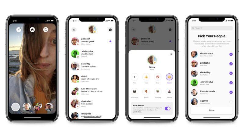
What is Threads?
Threads is like that telephone game you used to play when you were a child— one person whispers a phrase into your ear, and then you pass it down the line until the phrase “hot crossed buns see how they run” becomes “pot flossed runs, three cows love guns.” Only this time, one millionaire took another millionaire’s web developers and had them recreate an app using similar code.
Threads, according to Threads, is an app “built by the Instagram team for sharing text updates and joining public conversations. You can log into it using your Instagram account, and posts can be up to 500 characters long and include links, photos, and videos up to 5 minutes in length.”
So… yeah. It’s basically just Twitter but with slightly lengthier features. As of yet, Threads’ creators haven’t implemented (or shall we say, “figured out how to replicate”) the “follow” feature, so unlike Twitter, there isn’t a curated news feed comprised of a user’s followers.

Regardless, Threads has yet to offer a unique value proposition for its users that’s different from anything that Twitter currently offers, and according to Fortune.com, it’s also lost half of its active users in less than a week since its media-blitzkrieg of a launch. And in case you didn’t know, a Threads account cannot truly be deleted unless one deletes their entire Instagram account (only deactivated)… so any statistics Meta wishes to publicize may be prone to manipulation. Which Meta would never do, would they…?

Without a clear reason for existing other than a billionaire’s personal quest to troll a fellow troll (game recognizes game, Musky), Threads’ entire viability truly hangs in the balance of whether or not the Zuck chooses to differentiate it in some way, shape, or form from Twitter.
Otherwise, other than ego, greed, and mommy issues… why?

How Can Threads Benefit Small Businesses?
So before you sell everything and pack up your Twitter bags to migrate all of your threads over to Threads, take a deep breath, sit back, and relax a bit. Currently, your best bet is to see how this whole thing plays out.

Besides, it’s not like Instagram didn’t already kill off an app called Threads a few years ago, anyway… so maybe it’s best to give that app some grieving time before jumping into a new one (out of respect for the victim).
And speaking of past failures, Facebook has had its own set of failed endeavors too, starting with the horror show that was their dating app (a truly terrifying experience for any woman) and their brief foray into mobile-tainment programming that was “Facebook Watch.”

Despite the early fuss over Threads, it’s too soon to tell if the app truly has any staying power. After all, it’s such a carbon copy of Twitter that there’s no clear advantage to using the app at the current moment.
However, that doesn’t mean that things won’t change. The one thing that Meta succeeds at that Twitter doesn’t is paid advertising and cross-platform integration. So, don’t discount the fact that users may find it easier to post on Threads through future integrations via Facebook or Instagram. And don’t discount the fact that paid advertising and catering to marketers may be a future game changer for Threads one day.
Will Social Media Fatigue Kill Threads?
Fads wear thin. And we all know the internet has the memory of a clownfish when it comes to keeping track of things they’ve canceled, so who knows how long people will rebel against Elon’s ownership of Twitter (because, at the core, that seems to be what Threads is hoping to monopolize on). Being a giant media conglomerate also isn’t proof of success; it’s simply proof that a platform has substantial financial backing. Can you say “Google Plus,” “Amazon Fire Phone,” or “Tubi”?
While users want to be entertained, do any of us still have the mental capacity for an app that brings nothing new or novel to the table? More importantly, do marketers want to invest in yet another social media platform when they’re already stretched thin amongst the spread of TikTok, Instagram, YouTube, Twitter, LinkedIn, and Facebook?

Perhaps if Threads can find a way to implement paid advertising in a way that Twitter can’t, it may prove more enticing and offer some faint glimmer of monetizable value. But for now, it’s just kind of there. And honestly, there’s better programming on Twitter already.
Should I Create a Threads Account for My Business?
While there’s certainly no harm in creating a Threads account, there’s also no grand reason at the moment to invest too much time or effort into it. At least, not until Threads develops into something that is in some way, shape, or form distinguishable from Twitter.
In other words, keep one eye open, don’t sleep on it, but don’t fret about it too much, either. If Twitter is your main platform, then it’s wise to go ahead and invest in a Threads account. But if Twitter isn’t your social platform of choice, then Threads probably won’t offer you much ROI at the moment.
If you do choose to create a Threads account, then at the very least, have something to say and find subtle ways to differentiate it from your Twitter account; otherwise, what’s the point?
Consider airing the short-form content that’s too long to put on TikTok, Instagram, or Twitter on your Threads account. And make sure, above all else, that you’re there to entertain, educate, or offer a unique viewpoint that your audience can’t find anywhere else.
Final Thoughts
So to all of the teachers who taught us millennials that plagiarism never pays off… Mark Zuckerberg would beg to differ.

And if you, dear reader, just like the rest of every marketer out there, are simply too tired to deal with yet another digital void we like to call social media, then welcome to the club!
But in the meantime, if you’d like to dip your toes into the world of Threads, we’re here to help you devise a strategy that works best without spreading your resources too thin.
So if you’re ready to be plugged into the wubbulous world of Mark Zuckerberg’s Metaverse, we’ll make sure we slip you that blue pill so you’ll never have to live a day without going unplugged.

To talk shop and create a strategy best suited to your business’s objectives, schedule a free consultation with our marketing team.
We’re back, baby! Another year, another chance to spotlight some of our favorite design trends that we’re loving in the digital web-o-sphere this year, and it looks like some of our predictions from 2020 have had some serious staying power. And if we’re being completely honest, we secretly hope that all of the failed telekinesis training from when we were eight-year-olds trying to move the clock hand forward so that we could leave time out a few minutes early has finally paid off in the form of becoming clairvoyant.

While exposed grids, increased accessibility features, color blocking, and oversized type still reign supreme in the land of digital design, we’ve managed to compile a list of a few of the newest trends the post-pandemmy era is ushering in.
And while we don’t recommend hopping on any of the latest fads just because they’re cool at the moment (we’re looking at you, bucket hats and Crocs), we’ve compiled a list of some of the trends we see hanging around over the next few years.

So whether you’re looking for a website overhaul or simply planning to build a site that stays fresh for years to come, staying on top of the latest trends is essential to ensure your site remains relevant and consistent with your overall brand messaging.
Moving Typography
Animations aren’t just for artistic elements on a page anymore. In fact, we’re seeing an increased number of websites utilizing animations to bring typography to life. Why simply write a word when you can bring the essence of the word itself to life instead?

Along with text animations, we’re also seeing a growing amount of interactive text that comes to life whenever a user hovers over it. Not only do these animations add a sense of fun to a website, but they also work to visually draw attention to specific parts of a page (which is especially handy if you’re hoping to Jedi mind-trick a user into clicking on a specific link).

3D Art
3D graphic design technology has come a long way in recent years, with tools like Cinema 4D and Adobe making it possible to create realistic, three-dimensional artwork. We expect to see this trend grow in scope as graphic designers become more entrenched in the software programs used to develop these Pixar-like images and specialty fields specific to 3D graphic design expand.

Serif Fonts
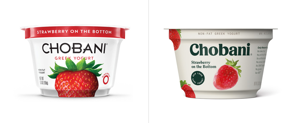
Serif fonts have been out of style for quite some time, at least until the past few years, when companies like Mailchimp and Chobani rebranded using bold Serif fonts for their logos, with many other businesses following suit.
While sans serif fonts have dominated the forefront of web and graphic design mediums over the past decade, many brands are utilizing bold colors paired with serif fonts to give their company a retro-chic, high-end vibe. We expect this trend to thrive in the coming year as 90s/Y2K nostalgia hits its peak stride with Gen Z.
Maximalism
So maybe you’ve always been under the impression that keeping it simple (stupid) is the way to go when it comes to web design. And while minimalism certainly has its place, many companies and brands are opting to use large typography, bold color combinations, and layered images to draw attention to the design.

Personally, we’re digging the bright colors and bold choices that maximalism encourages. Anything to get us out of the sad beige-everything era!

Claymorphism
Everyone, well, everyone except for the cold, heartless demons in the world who refuse to give animated movies a chance, has a fond place in their heart towards beloved Claymation figures like Jack Skellington, Coraline, and Wallace and Gromit. So it’s no wonder Claymation-style art renderings still prove popular across the web as a way to represent the human figure with an element of levity.
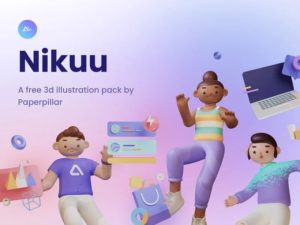
Typically used with a gradient background or to explain a company’s onboarding process, we don’t expect these 3D human figures to go anywhere anytime soon.
Behavioral-Based Design
Apps like Noom and Headspace are revolutionizing how notifications can be implemented to influence positive behavioral changes for their users. Behavioral design seeks to create a user experience curious enough for a person to change their habits. By crafting rewards, points, badges, and friendly reminders, these apps and websites exploit the human psyche to motivate people to change their behavioral patterns for the better. And it’s a trend we’re seeing across the mental health and physical wellness space, as apps designed to better our lives find ways to understand our basic psychological patterns.
And besides, if we’re being sincere, we love constantly feeling like a world-class athlete every time our Apple Watch rewards us for standing up, so… we’re all for trends that make us feel better about ourselves anyway.

Pixelation
Want a design aesthetic no millennial is sure to resist? As we mentioned earlier, the 90s are in fashion, and for whatever reason, the Y2K digital aesthetic is now something to be admired. On the bright side, however, this means designers are purposefully forgetting about the vibe that was Geocities and Angelfire home pages, so…everything looks prettier with rose-colored glasses on!
How designers are choosing to reconceptualize the 90s/Y2K era includes pixelated renderings a la Windows ’98, with colorful gradients and stylized fonts that bring users back to a rosier version of the time period, and albeit, the version it sure felt like we lived in, even if it wasn’t exactly the world we lived in.
Conclusion
Perhaps the biggest trend we hope will come to fruition in the coming years is the bold usage of color in design again. While the beige color scheme had its brief fun, we’re ready to move on to brighter, bolder days that breathe fresh life into the online aesthetic.
And while we’re not entirely opposed to the fascination with the 90s/Y2K era (we’re not monsters, after all), it’s best used in moderation. Too much of a good thing can begin to leave a sour taste in the mouth—so best not to overdo it, as it will likely begin to phase out once Gen Z ages up in the coming years.
Ahhh… job referrals. That forbidden segment of a job application that draws into question every single relationship you ever made at your last place of employment. How loyal is my allegiance to my former boss? Did they actually like me, or will they choose to blindside me at the tribal council if I list them as a reference?
I mean, who among us hasn’t, in a downward spiral of anxiety, begged their closest friend to pretend they’re your boss so that you can secure a glowing review over your past work performance to future employers? Anyone?

…no? Just us?
Ahem… well, although faking professional references may be a reasonably simple art form, the same doesn’t hold true when it comes to garnering professional client referrals. This, my dear friends, is something you’ll have to work at if you want to gain legitimate headway in your business.
So while yes, you can and should still rely on word of mouth from friends to help your business grow, you’re also going to have to be way more proactive in convincing former clients to throw in some good references about your company. If you ever want your prospective client base to expand, plan to network like you’re a low-level production assistant making coffee runs in Hollywood, baby!

What is a Business Referral?
A business referral is when a former client recommends your business to a prospective client either organically in conversation or purposefully in an attempt to market your company. Organic referrals tend to be the most effective type of referral and are an extremely powerful tool to tap into other social networks that may be outside your targeted advertising range.
Referrals happen as a direct result of your efforts to cultivate a positive relationship with a client. The more effort you invest into client relationships, the more likely those clients will recommend your services to friends. So don’t be afraid to ask a client to refer your business to others if they had a positive experience!
We totally understand that figuring out how to effectively increase your client referrals can be overwhelming and stress-inducing, especially for fellow introverts like ourselves. Ergo, we’ve compiled a few of the best ways you can easily boost your referrals without having to schmooze it up at your local “Empowered Entrepreneurial Boss Boys and Babes Under 29 and over 5’9” group.

1. Go Above and Beyond
While it may sound obvious, this is by far the most crucial step you need to take to generate powerful word of mouth. The goal is to make your client feel like the prettiest princess at the ball— we’re talking princess of Genovia pretty here, folks, so get that hair straightener ready.

The more special you make your client feel, the more likely they are to recommend your services to others. So while providing excellent service is undoubtedly one aspect of the equation, consider other ways of making your client feel unique, such as posting about them on your social media or blog pages (which they’re likely to share with their audience), giving them a special shout-out on your website, or anything else that is certain to make them feel like the belle of the ball.
2. Give Back
We dare you to name one person on this planet who doesn’t like free stuff. Like, maybe James Corden because he seems to fervently ridicule anyone who makes less money than him, but other than that, we virtually guarantee you that no client is going to turn away a free gift card, free subscription to your services, or cash back in exchange for a positive client referral.

And while we’d all certainly like to believe that all Amazon reviews are genuine, the truth of the matter is that companies are utilizing powerful incentives to increase their ratings and outreach, including discounts on future purchases in exchange for positive feedback. So while we’re not saying that’s necessarily the right approach for everyone, it’s still important to consider the referral strategy that makes the most financial sense for your company and to harness that power to increase your client base.
3. Make it Personal
Get to know your client on more than just a first-name basis. This doesn’t mean you need to make every client your new BFF like you’re an adult in their 30s who suddenly is having trouble making any new friends because adulting is, like, really hard. No one warns you about how impossible it is to maintain friendships when you get older… but um, you should at least try to learn a few details about your clients so that you can fully understand how best to customize your services to fit their needs.

And if they tell you about personal events going on in their life? Remember those details and find ways of showing them you were paying attention, like sending flowers after the loss of a pet, sending them a Starbucks gift card on their birthday, or any other personal touches you can think of to make your services memorable.
4. Respond Appropriately to Feedback
Whether good or bad, feedback is an extremely valuable metric in determining how effectively you communicate with your clients. And before you think we’re about to spout that “customer is always right” line at you, think again because the customer is often insanely wrong.
However, in the eyes of other potential clients who didn’t see them banging on your glass doors after your store was closed, screaming, “Mr. Tinkles will literally die from pesticides if he can’t have his 100% organic veal custard pate cans! If you don’t open these doors, I swear to sweet baby Jesus I will Yelp about this!”, your response to their unhinged Yelp review will shape their feelings on how you negotiate with difficult situations.

So even if it feels incredible to clap back at someone’s negative review, just remember that it will deter potential clients. Respond to feedback publicly in a civil, empathetic manner, and offer private solutions to resolve the problem. If clients feel like you are on their side, then even those who put you on public blast may feel compelled to refer you to friends for how you handled the conflict.
5. Keep It Simple

It’s not that clients don’t want to refer you; it’s just that sometimes it takes too long to do it. Simplify the process by utilizing customer feedback tools such as SurveyMonkey or HubSpot and incorporating a referral link.
You may also consider creating a sample email template for clients who wish to refer you, which ultimately simplifies the process and impediments to that action happening.
Other ways of alleviating the obstacles between your clients and potential referrals include creating shareable content for social media, such as giveaways encouraging people to tag their friends. Plus, with a giveaway, you won’t even have to ask your client for a referral because you’ll have already incepted the idea into their head.

Final Thoughts
Referral marketing is one of the most potent ways to increase the scope of your client reach. And while there isn’t one correct way of doing it, the best choice is to see what strategies work best for your business. Don’t be afraid to adapt your approach as you go along, and remember that there is no one right way to do it!
If your Instagram has ever been hacked, you already know how painful it is to lose all your media and memories while having absolutely no way of reaching out to anyone at Instagram to get your account back. And not to mention you have no way of telling your friends and family that the person soliciting them to purchase bitcoin is not, in fact, you.
What a mess.
Needless to say, Instagram users have been begging for some sort of customer service connection in the event of a situation like this and well, Christmas came early this year! Instagram has officially announced a new avenue to recover your account should it get hacked.
According to Instagram‘s statement:
“To support accounts that are experiencing access issues or may have been hacked, we created Instagram.com/hacked – a new, comprehensive destination people can rely on to report and resolve account access issues.
If you’re unable to log in to your account, enter Instagram.com/hacked on your mobile phone or desktop browser. Next, you will be able to select if you think you’ve been hacked, forgot your password, lost access to two-factor authentication or if your account has been disabled. From there, you will be able to follow a series of steps to help regain access to your account. If you have multiple accounts associated with your information, you will be able to choose which account needs support.”
This is amazing news! To read the full article and for more information on how to protect your account from getting hacked, read the full article here.
Ahhh… The New Year. A time made for re-evaluating your decisions, like how you told your Aunt Linda your investment in Dogecoin would pay for your retirement by the end of next year. Or how you texted your ex, “Happy Flag Day—I wish I had seen the red ones in you. JK! Whatcha up to tonight? 😉😜” before hibernating from the entirety of the world for the next two weeks.

While it may not always be in your best interest to dwell on all the mistakes you’ve made in the past year, that innate desire to replay the details of your missteps can be good for your business—if done well.
A brand audit is essentially a way to contemplate professionally. Think of it as a way to review your brand’s major assets and messaging, such as content, website design, UX, SEO rankings, logos, brand visuals, and social media. When applied to a website, brand audits are vital to supporting its health, ensuring user retention rates remain high, and preventing older content from harming SEO rankings.
It’s out with the old and in with the new, so let’s get to the details of how you can thoroughly audit your website!

I Don’t Want to Do A Website Audit—Why Should I?
If you’re happy with your current website and visuals, it can be hard to evaluate them from an unbiased perspective. However, an audit can tell you how your audience views your brand. This is essential because it’s your audience that drives profit, so their opinion matters. And just like Meryl Streep in Sophie’s Choice, sometimes you just have to do it.

A website audit gives vital details into your site’s effectiveness, performance, and visual identity. By understanding what’s driving traffic and conversions, you can gain valuable insights that will improve your site for years to come.
The Main Benefits of a Website Audit
Okay, so we’ve convinced you that an audit is essential. But how exactly does it help? We’re glad you asked…
1. Improve SEO Rankings
Maybe you’re sick of hearing certain buzzwords like narcissist, gaslighting, and SEO optimization. We’ll leave the first two to the experts, but brace for impact, because we’ve got to delve into the importance of SEO.
SEO determines your website’s visibility. And visibility is everything when it comes to people reaching your page. After all, if Kim Kardashian posts a selfie on Instagram, but no one is around to read it, would the Internet ever break at all?

A website audit is designed to evaluate how discoverable your website is to search engines. And by using the data from your website audit, you can fix any SEO issues that may hurt your rankings.
Some things to check for when auditing your website’s SEO include:
- Checking all title, heading, description, image, and meta tags for appropriate keywords.
- Fixing any broken links or images on your website.
- Avoiding placing links on landing pages that may affect website bounce rates by encouraging users to click on said links too soon.
- Building high-quality, internal links.
- Incorporating content that lends itself to outside sites linking back to yours.
- Checking to see which sites are referring the most amount of traffic to your website.
- Cleaning up the back-end code to ensure pages are loaded as quickly as possible.
- Deleting duplicate content.
2. Convert Visitors into Leads
Sure, visitors for the holiday season are great, but you know what’s even better? Visitors who soil all your dishes, eat all your food, and use all your toilet paper but don’t contribute to the meal? (We kid….) Websites are similar—and what kind of a visitor is someone if they don’t end up paying for the services or products you’re offering before they leave?

Lead generation is one of the most crucial aspects to consider when performing a website audit, so always consider how productive your site is at growing conversion rates, including:
- Writing a concise call-to-action on every page— this can be a sentence, a link, a form, or a button.
- Placing the call-to-action in a visible location (i.e. not at the bottom of a 10,000-word article).
- Providing access to certain content, promotions, or other incentives in exchange for filling out contact information forms.
- Deleting excessive or minor calls-to-action (one or two should suffice).
- Using pop-ups to help users whose actions indicate they may be confused or have questions regarding your services (but use them sparingly).
3. Create More Relevant Content
Content is king, and nothing helps with search engine ranking more than high-quality, relevant content. While having a good backlog of content is certainly remarkable, it needs to fit within the vision of your company and your brand guidelines. That means if you’re a doomsday prepper company with blog posts detailing how to survive Y2K and the Mayan Apocalypse of 2012, it may be time to purge that in favor of prepping for the inevitable digital simulation invasion by Metaverse instead.

Some other ways to audit your content include:
- Dividing content into blocks, bullets, infographics, and images.
- Ensuring that all content is in some way driving your users to the end goal of a page, whether it be filling out a content form, contacting your business, or answering a frequently asked question.
- Fixing any content with spelling or grammar mistakes.
- Monitoring which content receives the most visitors.
- Responding to users in the comment section of articles to increase engagement rates.
4. Analyze the Competition
Website audits shouldn’t be insular. That is, it’s important to understand the market you’re competing in and who your biggest competitors are. By analyzing the competition, you can:
- Increase your understanding of how and what your competitors are ranking for.
- Improve business strategy and determine future campaigns.
- Generate ideas on improving branding and messaging.
5. Improve Website Design and UX
Users want to find the information they need as quickly and efficiently as possible, so let’s leave the feeling you’re navigating the winding back-alley streets of Italy via a moped up to Jennifer Coolidge and not the users of your website.

UX design can be improved by considering the following:
- Is your website responsive on different devices such as laptops, cellphones, tablets, etc.?
- Is your site designed to meet accessibility standards for those with visual, hearing, or other impairments?
- Does your page have a logical flow, indicating that a foundational information architecture has been constructed?
- Is the site user-friendly, affording visitors the opportunity to make mistakes and correct them easily?
- Are the visual elements of your page legible, fluid, and designed to prevent slow web page loading times?
- Is your company’s description and key differentiators easily viewable on the first page of your site?
Final Thoughts
Just like any good musical artist, your website should constantly be evolving. There are always ways to improve your customer retention rates and generate new leads by improving your website’s basic functions.
A website brand audit forces a company to take a hard look at its performance levels and devise new and creative solutions to improve business practices. Do you need help with your website? We’d love to chat!
Ahhh, the Instagram Explore Page… what a fine way to spend a day of glorious, uninterrupted doomscrolling curated to your every whim and desire. But did you know that this boredom buster page is also good for more than dismantling a 3 am case of existential dread?

What is the Explore Page?
Click on that little magnifying glass icon at the bottom of your Instagram app, and you’re there—the Explore Page. Based on your personal connections and recent behaviors on the app, the Instagram Explore Page is the perfect concoction of engaging content put together just for you by the infamous algorithm. There you’ll discover a nicely curated array of photos, Reels, and targeted ads.
It’s basically a digital networking event that invites all the cool people at the lunch table across from you to your feed, filling it with the same content they enjoy in the hopes that you will, too!

Why Should I Want to Get on the Instagram Explore Page?
I mean, why does anyone want to be famous, really? Is it the money? The fame? The burning desire to compensate for the love you were never given as a child with the love from your fans? But we digress…

This one is really quite simple to explain—getting on the Instagram Explore Page equals more views, engagement, and, ultimately, sales. The more brand awareness you cultivate by reaching new audiences via the Explore Page, the more profitable your brand will become.
It’s not just about blasting your visuals mindlessly to just anyone; it’s about targeting a group of users that will likely be drawn to your company’s product or mission.
Best Ways to Appear on the Instagram Explore Page
So how do you get an invitation to the A-list party that is the Instagram Explore Page? It’s not exclusive as you might think, so put down your first-born son and tell the gods to hold on a sec.

Let’s go over a few of our favorite tips and tricks for landing on the Explore Page:
1. Diversify Your Feed
That’s right—Instagram is evolving, and so should you! One sure way to be favored by the algorithm is by posting a variety of content, be it Reels, carousel photos, Stories, or lives. Not only will this content help with your discoverability, but it will also help to create more engaging content with your audience. Staying up-to-date with the latest trends and viral videos is a surefire way to gain more likes and shares, so invest time in creating high-quality, engaging content on Instagram through a variety of Instagram’s available mediums.
2. Invest in Paid Ads
Let’s face it—sometimes it’s okay to hit the cheat button, especially when it comes to paid ads.

While it may feel a little naughty, trust us when we tell you that it’s the easiest path to amplifying your audience. Instagram’s paid advertising displays your content to users browsing the Explore feed, and while it won’t display your ad directly on the home Explore Page, it will show up whenever a user clicks on an Explore frame and scrolls down. Visibility is everything, and Instagram ads guarantee visibility to the audience that matters most for your company.
3. Partner with Influencers and Brands
Why are popular people popular? Aside from being genetically blessed in the looks department, popular people know a lot of influential people. Instagram is a lot like high school (sans the hormonal acne), so apply those #adulting skills and network like your momma’s business Meetup group taught you!
Organically growing your audience through cross-promotion with other influencers and brands is one of the best ways to reach new users.
Don’t be afraid to slide into another content creator’s DMs (unless you’re a #wifeguy, in which case, now’s really not a good time to take that risk).
4. Sponsor Contests or Giveaways
At the end of the day, any call for engagement from your audience is a win, so consider promoting your brand through contests or giveaways. Free giveaways that encourage sharing, commenting, and tagging friends are a great way to expand the reach of your posts. Additionally, by encouraging users who win your contest to share photos of their loot, you’re also expanding growth even further. The prize doesn’t have to be crazy high value, but it should be compelling enough for people to enter, so be sure to choose wisely.

5. Utilize Instagram Analytics
It’s important to know what works and what doesn’t. We like to believe what we’re most proud of will resonate with our audiences, but the sad truth is that it’s usually a post that we can’t predict. Want to know how your posts really perform? Instagram has built-in analytics that are quite useful. Additionally, 3rd party tools such as Later allow you to track your marketing strategy by analyzing links, clicks, page views, and click-through rates to see how much money a certain post or ad generated. If you’re seriously invested in growing your business, you need to get even more serious about tracking your social media numbers.
6. Post at Strategic Times
If a post goes live, but no one’s around to see it, did it ever really happen at all? Let’s say your target audience is a bunch of 20-year-olds. If you post something to your Instagram at 7am, do you actually think they’ve nursed that hangover long enough to stare at the bright lights of their phone screen through a massive headache?

To be honest, they likely won’t resemble anything other than a zombie until at least 1 pm, so it’s important to understand your audience’s very specific browsing times before posting that gorgeous pic to your feed. The more people who see your post, the higher your engagement. So take advantage of those Instagram Analytics tools and figure out when your users are the most active.
7. #Strategic #Hashtags

Strategery. It’s not just a word invented by George W. Bush… It’s a word that would have been trending and hashtagged into oblivion had Instagram existed back in 2001. While not as important as they would lead you to believe, hashtags are still an excellent tool for categorizing your content. While it’s tough to get discovered in the feed for your hashtags, it’s still possible, so consider using hashtags with a lower post amount to gain a better chance of actually being seen. Pro tip: make sure they’re relevant, specific, and driving engagement.

Final Thoughts
The Instagram Explore page is an indispensable tool for marketers, so it’s essential to understand how to use it to your advantage. If you use our tips, your organic posts can wind up on the Explore Page in front of entirely new audiences. And even though your ads may not appear directly on the Explore Page, they’ll pop up as users scroll down on posts they click onto from the Explore Page, making a great way to bring attention to your brand from new audiences.
If you need help with Instagram strategy, look no further. We’ve got you. Let’s chat!
Do you ever find yourself reminiscing about the good old days when you would go home from school, blast your favorite Jimmy Eat World album, and write vengeful, yet emotionally vulnerable posts secretly dedicated to your ex on your MySpace or Xanga page? Yeah… neither do we…

Years later, have you found yourself thanking the high heavens that no employer has ever successfully been able to hunt down the sophomoric rantings of your former, hormonally overactive self? Well, we’re here to let you know that it probably wasn’t for a lack of trying.
Any good employer does a good Google search before hiring a new team member. The reason they can’t find you? It’s probably just because your SEO game was… let’s say, below par.

What is SEO?
So what exactly is SEO, and what can it do for your business, or for that matter, your Tumblr account from 2005? SEO simply defines which results appear in the almighty chain of the Google search hierarchy.
We know, we know. SEO sounds scary, it’s full of weirdly technical terms like “Largest Contentful Paint,” “Garbitrage,” and “Astroturfing.” But when you actually start to understand what SEO terms describe, you’ll realize a trend—they’re overcomplicating a terribly simple concept. At its core, search engine optimization really just boils down to labeling your HTML elements properly, creating important content, minimizing your page’s load time, gaining clout by having other websites link back to your website, and practicing good UX design.
Ultimately, SEO determines who finds your website and how they got there. Spoiler alert: they found it through Google.
And while we can almost certainly guarantee that your old Tumblr page dedicated to the latest spottings of Kiefer Sutherland next to a Christmas tree won’t result in many SEO hits (errrrr… then again, it might?), it’s at least important to know the reasons why.

Let’s delve into some of the biggest SEO marketing trends in 2022 that you should be taking advantage of!
SEO Trends for 2022
1. Design with a Mobile First Mindset
Google is constantly updating its search engine algorithm, which is important because these updates can often affect a page’s search engine rankings. One of the biggest updates to the Google algorithm came in 2019 when Google first announced it would prioritize websites designed for mobile platforms first. This meant that pages with non-responsive designs which only loaded properly on desktop screens (and not on phones) would take a backseat to more mobile-friendly pages. This also means that it is now vitally important that your website is designed for mobile audiences first. If your website isn’t responsive, then your search engine ranking will suffer. Phones are the wave of the future people…. And guess what? The future is now.

2. Create Relevant, High-Quality Content
We cannot stress enough that posting high-quality content is absolutely the most important thing you can do to boost your SEO ranking. Once you have hooked a user onto your website, it’s time to reel them in, and high-quality content is designed to keep them on your website for as long as possible. Informative, interesting, and new content is key. Just like any good advertising executive, you need to create a product that your audience will continue to want. What was your audience searching for when they landed on your webpage? Does your webpage provide them with an answer to their question? Does it provide them with even more related information that they can continue to explore? If it doesn’t, then go back to square one.
3. Label Your Header and Title Tags Properly
What’s in a name? While that cute, quirky title that’s offbeat and a little weird might seem like a good idea (do you know how hard it was not to title this article, “Great Googly Moogly, Batman!: An Expose on Googling Yourself), it’s actually going to hurt your SEO. Yeah, yeah, we know you’re a young, aspiring writer who wants to rebel from societal standards with off-kilter references that no one understands, but show some restraint, buckeroo. Because it’s hurting your SEO. That’s right, titles matter. And it turns out, so do subheading titles (or if you want to get nerdy, your H1 tags to be specific). Google’s latest algorithm will now replace some sites’ titles with their H1 tags in an attempt to generate better title names for websites. Every word counts. And it’s not just titles, all of your metadata counts, especially when it comes to your HTML script. We know that alt-tagging images seems sooooo annoying, but ultimately, it’s going to make your images appear in search results, which brings visitors to your page. And we absolutely mean it when we say that every word matters. If your business is called “Selfish Love” don’t use a URL that’s called shellfishlove.com. Splurge for that proper URL domain name.
4. Create Good Information Architecture
Organize, organize, organize. Like the great Marie Kondo once said, “Keep it simple, stupid.” Ok, so maybe it wasn’t Marie Kondo who said that, but she’d definitely still be okay with us attributing it to her. Regardless, the same principle applies to your website. Pages should be easy to find. You shouldn’t have to go to page three of your “About Us” page to find a link to contact a business. That’s why people leave bad Yelp reviews. Well that, or they’re just customers who weren’t actually right. It’s also why Google will rank your website lower. Invest in someone who understands good UX design and proper information architecture when designing your website. Just like Marie Kondo, Google appreciates a website that lives in an organized, uncluttered space.

5. Build Backlinks
When in doubt, go chase clout. You may mock them in public, but influencers are basically rocket scientists when it comes to understanding the importance of backlinks. Popularity amounts to the people you know talking about you. That same principle applies to your website too. This means finding other important people to post links to your page on their website. Unlike influencers, however, buying those likes or backlinks will cost you. Google can tell when your site is being shelled out by low-quality websites for backlink love, so pick and choose your friends wisely.
6. Optimize Page Speed
I mean, this one’s pretty self-explanatory, but basically, the longer your site takes to load, the more likely someone is to leave your page. And ain’t nobody got time for that! So don’t bog your website down with oversized images, overly complex graphics, and fancy fonts that have to be compressed down. Take time to ensure that your website takes less time to load than your competitors.
7. Check Your Page’s Core Web Vitals
As part of a 2020 update, Google started considering a set of measurements called Core Web Vitals. Core Web Vitals essentially applies quantitative standards to measure the quality of a site’s UX design. using three metrics—first input delay (which measures interactivity), largest contentful paint (measures loading performance, actually the real name), and cumulative layout shift (measures visual stability). In doing so, Google is hoping to prioritize a user’s experience into their SEO rankings.

Final Thoughts
While SEO trends may seem daunting or intimidating to keep up with (we’re still trying to keep track of whether or not high-waisted jeans are still in fashion), it doesn’t have to be!

SEO is about making sure your website stays visible to search engine users. Afterall, website visits equal conversions for your business. And while the Google algorithm may constantly be updating and changing small factors in what makes your website visible on its search results page, a few factors never change: good UX, a strong backlinking game, and high-quality, informative content. Master those three elements, and then you can finally start to focus on keeping your website up-to-date with the latest and greatest SEO trends!
If you are still confused or simply want someone to audit and update your website SEO, we’re always here to help.
Listen guys—we’re not gonna lie to you. This whole “Instagram” thing has been a rollercoaster from the start. It can sometimes feel like the rules of the game change the second anyone finds out what the game even is. (RIP to the good old days of posting a pixelated sunset photo with the Lo-Fi filter. ✌️)
How The Algorithm Affects Engagement
If you’ve been in the Insta-world for any amount of time, you’re probably familiar with the villain known as “the algorithm.” 👹 The algorithm is the name of the ever-changing set of rules that decide what content gains traction, builds engagement, and gets your name (and posts) out there to a larger audience. Coincidentally, it also decides which posts are shadow-banned and thrown into no man’s land, never to be seen by a soul.

What Can I Do to Help My Engagement?
With the Instagram platform still evolving, they like to keep a lot of the algorithm a mystery. However, the leaders of Instagram have shared a few things explicitly. While it started as a photo-sharing app, in order to compete with other popular social media platforms (*cough*, TikTok), Instagram has made a clear shift to favoring video content over photo posts. In fact, we wrote a whole blog about the announcement that Instagram is no longer a photo-sharing app, if you want to check it out!
But back to the matter at hand—engagement. First, let’s look at the kind of posts you can share and what kind of engagement you can expect from those posts. Then let’s dive into a few good user practices outside of posting that will also help with your engagement.
The Best Post Formats to Increase Engagement
1: Reels
In the last year and a half, Instagram has been very open about its favoritism toward Reels. In fact, the CEO of Instagram just announced that all videos on Instagram will now be Reels. We’ll keep you updated on what this looks like practically.
Anyway, back to Reels. This video format has become a popular choice for individuals, creatives, and business accounts to gain traction in a fun and engaging way. These short-form videos can range from 15-90 seconds in length.
Reels have been met with a variety of reactions from content creators. While some of us originally responded like Regina George (“Stop trying to make Reels happen”), most users have now come to accept that Reels aren’t going anywhere anytime soon—for better or for worse. And the truth is, they’re the best option to boost engagement and appease the gods of Instagram.
2: Carousel Posts
When it comes to engagement and visibility, your second best option is a carousel post. These posts are when you have a series of photo slides, and according to multiple analyses from 2019-2022, they are next in line for what the Instagram algorithm likes to see. Carousel posts can be a series of photos or educational graphics that add value to your audience.
This is good news to creators who still aren’t *quite* comfortable with Reels or other video content, because it gives them some engagement and visibility within the format they’re comfortable creating.

3: High-Quality Photos
Despite the fact that Instagram started as a simple photo-sharing app, a single photo is now the lowest priority on the platform. But it’s not all bad news, since sharing a photo is better than sharing nothing at all. Posting single photos with higher quality and more frequently can help offset drops in engagement. However, depending on what field your business is in, it may be more worth your time to focus on some of the higher-priority post types.
Our Top Non-Post Tips to Increase Engagement
As fun as it is to stress over constantly having to create content for your social media, posting isn’t the only thing you can do to help your engagement rates. Don’t get us wrong—we love the anxiety and relentless pressure to create endless content as much as the next person. 😅

Luckily, there are other ways to help with your engagement. Something important to keep in mind is the idea of “you have to give engagement to get engagement.” Instagram values interaction and time spent on their app—real people connecting with other real people. Things like scrolling through your feed, liking and commenting on other posts (remember, it costs zero dollars to “like” or comment on a post you see), and using the interactive elements of stories—such as polls and sliders—all help show the Instagram algorithm how devoted you are to them. When they see that, they’ll want to #bless you with improved exposure and engagement in return.
Also in case you’re wondering—no, “follow for follow” and “like for like” aren’t going to help you out in 2022. 😉
Final Thoughts
We know Instagram can sometimes feel like the lawless wasteland of Mad Max. However, there is some method to the madness. Engagement percentages have dropped across the board over the last few years, so even if you’re doing everything “right,” you likely won’t see the same level of engagement you did in 2018—and that’s okay.

However, between leaning into Reels, carousels, frequent liking and commenting, and posting fun behind-the-scenes Stories—you’re sure to see those engagement numbers go up.
Have any questions or need help overhauling your social media presence? Drop us a line, we’d love to chat!