How to Create an Intuitively Designed Website
We hate to burst your bubble, but… being pretty simply isn’t enough in the age of digital domination where user experience reigns supreme.

In today’s day and age, users simply demand more from websites than pretty graphics and flashy animations—they demand a seamless, hassle-free experience where they can intuitively find and get exactly what they need.
Ever clicked on a website and thought, “Did a toddler design this when they were coming down from a Peppa Pig sugar bender?”

Trust us; you’re not alone. It’s 2023, and if your website still feels like it belongs in the era of dial-up connections and floppy disks, it’s high time for a revamp. Or, um… Scratch that. Maybe, it’s time to simply polish that up, call it nostalgia, and market it to the youth?

However, the original point still stands. If users can’t find the information they need, what’s to stop them from clicking off your site and onto the 2 billion plus other competitors one away?
Is your site optimized for aesthetics, or is it actually designed for the very people it’s meant to serve?
Let’s look at some of the smartest ways to incorporate intuitive design into your website.
What Is Intuitive Design?
Intuitive design isn’t just a fancy term thrown around by bespectacled tech hipsters sipping overpriced organic soy lattes. It’s the secret sauce distinguishing between a website that feels like a sleek, luxury sedan and one that looks like the Yale School of Art.
Imagine handing Shakespeare a smartphone and expecting him to order a pizza. Sounds like a bad 90s rom-com starring Gwyneth Paltrow, right?

Intuitive design ensures that even old Will wouldn’t be left hungry. It’s about making your website so simple and instinctive that you can glide through without a hiccup whether you’re 5 or 95, tech-savvy or tech-averse. No confusion, no “where-the-heck-do-I-click-now” moments. It’s the digital equivalent of walking into a room and instinctively knowing where the light switch is.
Intuitive website design is all about creating an online experience that feels second nature to the user. This means prioritizing simplicity and clarity, ensuring that navigation menus are easy to find and understand and that content is structured logically. It’s about predicting the user’s needs and serving up the most relevant information or functionality right when they need it.
Elements like consistent color schemes, familiar icons, and recognizable patterns all play a role. The goal is to eliminate any friction or confusion, making the user’s journey from point A to point B feel like a breeze. When done right, intuitive design ensures that the user spends less time deciphering the website and more time engaging with its content or completing desired actions.
The 8 Characteristics of Intuitive Design
Eight pivotal attributes that help define intuitive design include:
- Simplicity: Ditch the fluff. In the age of the 8-second attention span, no one’s got time for a cluttered mess. Make it clean, make it fast.
- Consistency: Don’t make users play guessing games. Whether it’s a button or a color scheme, uniformity is crucial.
- Familiarity: Icons should be recognizable, not abstract art. A cart should scream “Buy,” not “What’s this?”
- Clarity: Speak human. If users need a dictionary or a tech guru by their side, you’re doing it wrong. Besides, no one likes to speak to IT people. No one. Need we give you more proof as to why?
- Feedback: People aren’t psychic. If they click something, they want to know what’s happening. Now.
- Flexibility: Not everyone surfs the web the same way. Design for the masses but allow for some mavericks.
- Efficiency: The fewer steps, the better. If your site feels like a labyrinth, users will head for the exit.
- Error Tolerance: Oops! Everyone screws up. Instead of a cold error message, hand them a digital roadmap back to sanity.
Bottom line? An intuitive design shouldn’t feel like a brain workout. Let users glide, not stumble.
Why Should Companies Opt for Intuitive Design?
If you can’t find a way to make it from your homepage to the checkout page in less than a minute, then it’s time to rethink your entire design. In this day and age, time is a commodity, and the internet has been trained to have an attention span the size of a TikTok video. The faster, easier, and more intuitive your design, the better the overall experience for your users and the less headache for your brand in the long run.
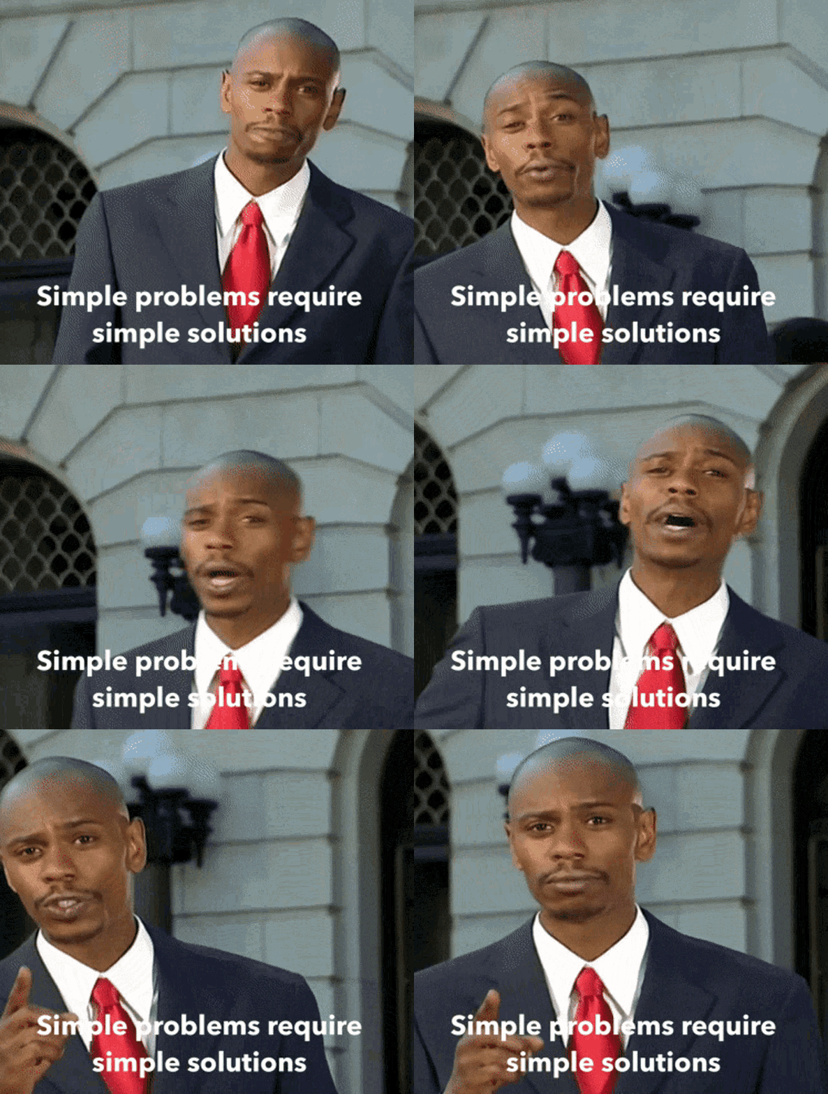
And besides, a simpler site doesn’t always equate to a stupider site. In fact, sometimes simple is much, much better when it comes to web design.

So let’s break down a few of the most important rules your site should follow.
Ain’t Nobody Got Time for That!
Consider Tik Tok the Pavlov of its time, conditioning users to anticipate immediate laughs, insight, or pleasure in the span of 60 seconds or less. They expect no less from their website. If users can’t find what they’re looking for in seconds, they’ll bounce faster than you did that time your Hinge date asked if you wanted to see how hard he could rev his Prius.

An intuitively designed website ensures that users don’t need a roadmap, a compass, or a seasoned sherpa to navigate to the exact destination they intend to visit—so having the right signifiers, icons, and website copy to guide users to their destination spot should come first and foremost before any other considerations.
First Impressions Matter. Like, a Lot
Remember that time you photo-dumped every drunk shot from your wild night out for, like, your entire college career? Yeah. Your employer didn’t. And on a side note, maybe that’s why millennials can’t afford housing?

Similarly, your website is often the first impression people have of your company. So don’t dump every ounce of your design knowledge you have onto the landing page.
An intuitive design should be simple, clean, and easy to navigate. A messy, overdone site either wreaks of a design agency going buck wild on their home page or suggests an inexperienced company unworthy of a user’s trust.
Reduced Tech Support Nightmares
Intuitive design isn’t just about looking good; it’s also about functioning seamlessly. No one wants to dial a helpline just to locate the “Contact Us” page. Making your page simple and easy to find human help when a user needs it most is one of the most critical things you can do for your site.
After all, the last thing you want is your eating disorder chatbot to help your clients by telling them to eat fewer calories… which is sadly a very true story.

And on that note, you should also resist the urge to over-automate. While Chat GPT and artificial intelligence can undoubtedly help direct customers to helpful advice or information, it’s still no substitute for a live human being on the other line.
Increased Conversion Rates
An easy-to-navigate site keeps visitors longer and makes them more likely to convert– be it signing up for a newsletter or making a purchase. Do you want your user’s journey to feel like a stroll in the park or a trek through the Amazon jungle with a broken compass?

It’s Cost-Effective in the Long Run
Think of intuitive design as a one-time investment that will pay off dividends in the future. Fewer redesigns, fewer customer support woes, and a significant drop in potential clients clicking away in frustration all translate to more pennies in your pocket.
Final Thoughts
To wrap this up, if you’re still on the fence about intuitive design, consider this: the digital realm is a brutal, unforgiving landscape. Sites that don’t adapt (read: aren’t user-friendly) get left behind.
So, unless you want your website to be a relic of a bygone era, discussed in hushed tones like the fact that you voted for Kanye for president before you realized you were really just encouraging an antisemite’s mental breakdown, then it’s high time you embrace intuitive design.

In the world of web design, remember: it’s survival of the fittest. Or, in this case, survival of the slickest. So if you’re looking for an extra hand to optimize your site design, the team at Tangible is ready to whip your site into tip-top shape.
So don’t be shy and go ‘head girl, go head get down… into our DMs.
…yeah, too soon.
Time for business.
Leave the marketing to us.
Don’t be shy—set up a free discovery session with our team today!